TKCL Website Redesign
A 60% bounce rate on service pages, no clear CTA hierarchy, and prospects saying "the website feels messy." Four months to fix all of it.
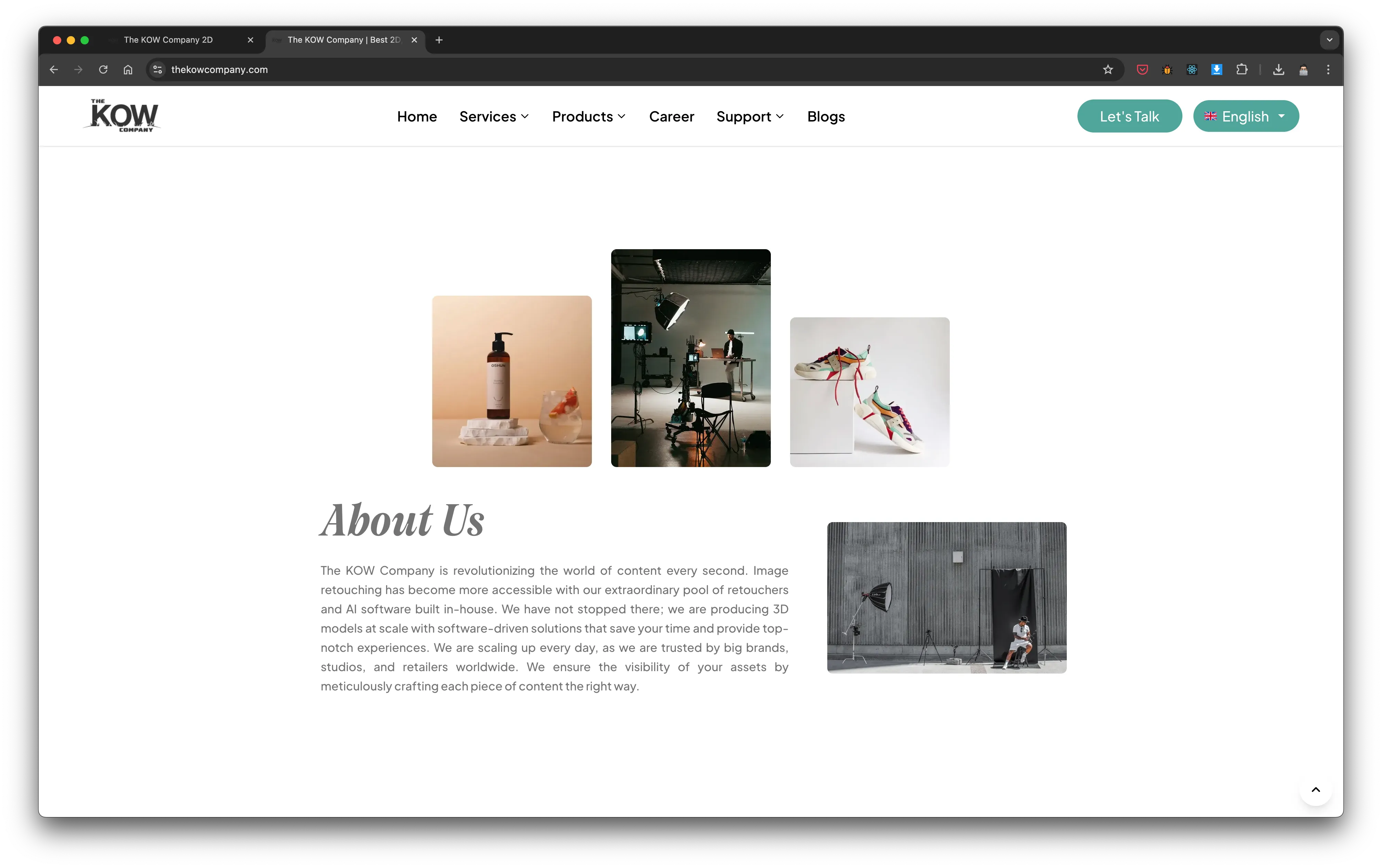
TKCL is a creative production studio serving 50,000+ yearly orders for e-commerce clients — 2D image editing, 3D rendering, and AI-powered content. The capabilities were there. The website wasn't doing them justice. Prospects landed, got confused, and left. My job was to redesign the experience so the site converted the traffic it was already getting.
The Problem
Analytics showed a clear pattern: high traffic to the home page, 60% bounce on 2D service pages, 40% on 3D. Users showed intent — "Book a Call" was getting clicks — but scattered CTAs and cluttered navigation meant they couldn't follow through. The site was generating interest it couldn't capture.
Key Results
- 36% bounce rate vs 39–42% for every major competitor
- 4.3% lead conversion rate — highest in competitive A/B test
- 15% CTA click-through rate with just 2 focused CTAs
- 3.1 pages per session average — up from scattered single-page exits
Role
UX & UI Designer
Timeline
4 Months
Team
Marketing Lead, Web Developer, CEO
Tools
Figma, Google Analytics, Notion
Before — cluttered, no clear hierarchy
After — clear value prop, one primary CTA
Start With the Data, Not the Design
Before I touched a single frame in Figma, I went through everything: Google Analytics exports, stakeholder interviews with the Marketing Lead, sales call transcripts where prospects asked the same questions over and over. The site had a problem, and the data told me exactly what it was.
HOW MIGHT WE: make a visitor understand what TKCL does within 10 seconds? How might we design a service structure that doesn't split the user's attention across 6 competing CTAs?
What the Analytics Showed
The home page was the strongest entry point — high traffic, reasonable time on page. But service pages were turning into exit points. Users were arriving with intent and leaving without converting.
What Prospects Were Actually Saying
Sales and support calls kept surfacing the same friction points. These weren't UX opinions — they were real objections blocking real revenue.
Competitor Analysis: Where Everyone Else Over-built
I audited Pixelz, Bright River, and bZm Graphics across navigation, CTA clarity, and conversion path. The finding was consistent: complexity was their weakness.
Strategy: Two CTAs. That's It.
Every competitor was running 4–6 CTAs per page — "Get Started," "Learn More," "Book a Demo," "Schedule a Call," "Free Trial." The research was clear: more CTAs dilute conversion. Users experiencing choice paralysis don't choose anything.
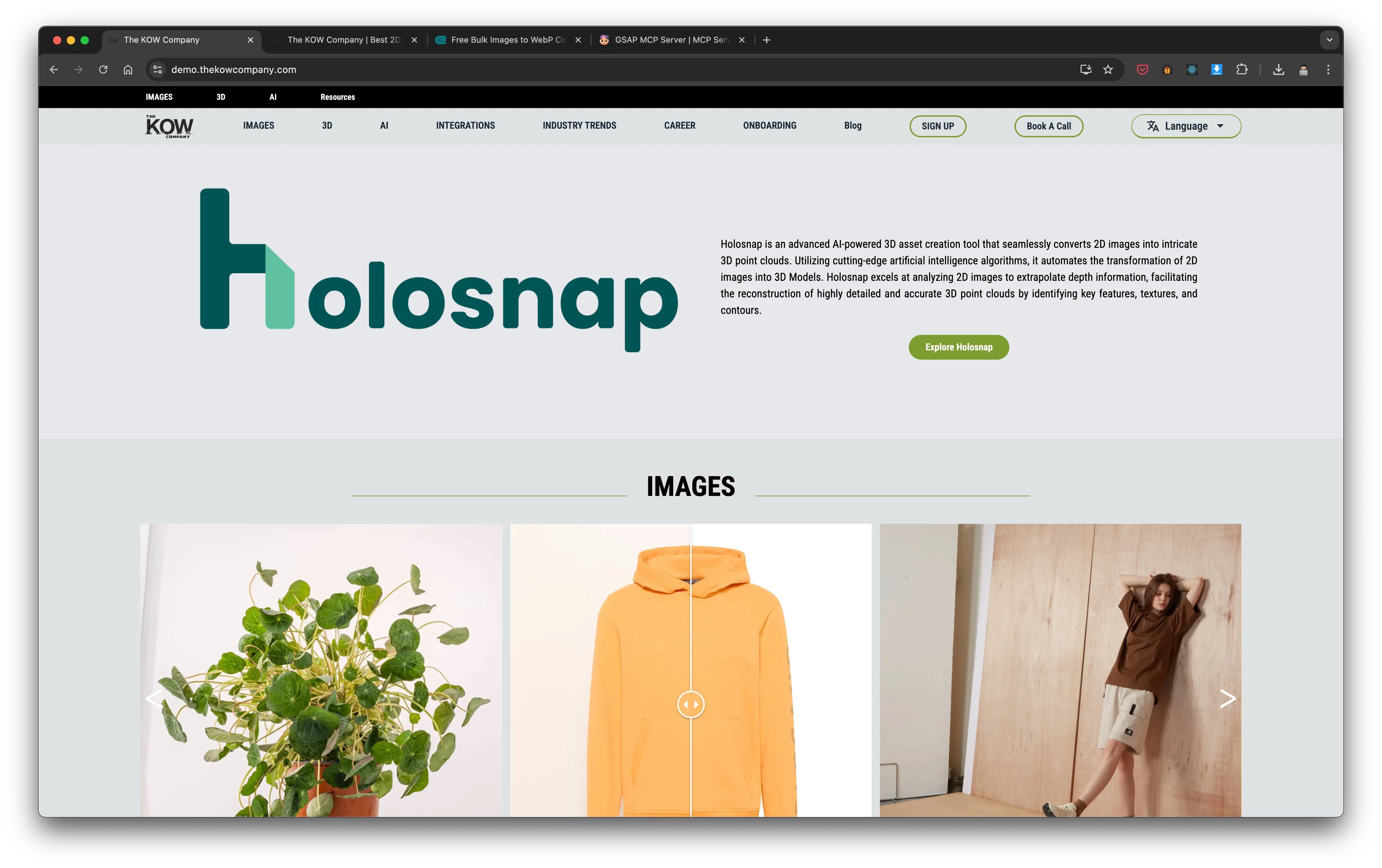
I made the call to run the entire site on two: "Let's Talk" as the primary conversion action, and product-specific CTAs for the AI tools (Retouched.ai, Holosnap). Every other CTA on the old site was removed or consolidated. The result was a 15% click-through rate — the highest in our competitive A/B test.
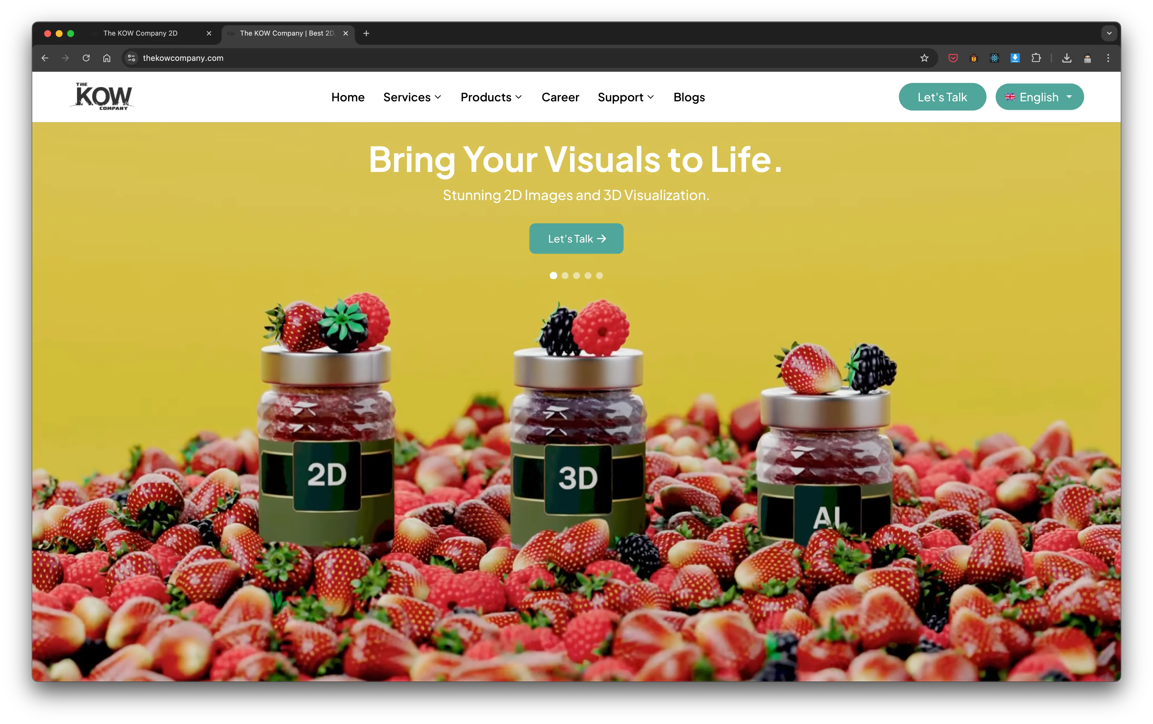
The second major decision was the information architecture. Services needed to be structured by type — Image Editing, 3D, AI — with nested pages that let users go deeper only when they wanted to. Broad at the top, detailed on demand.
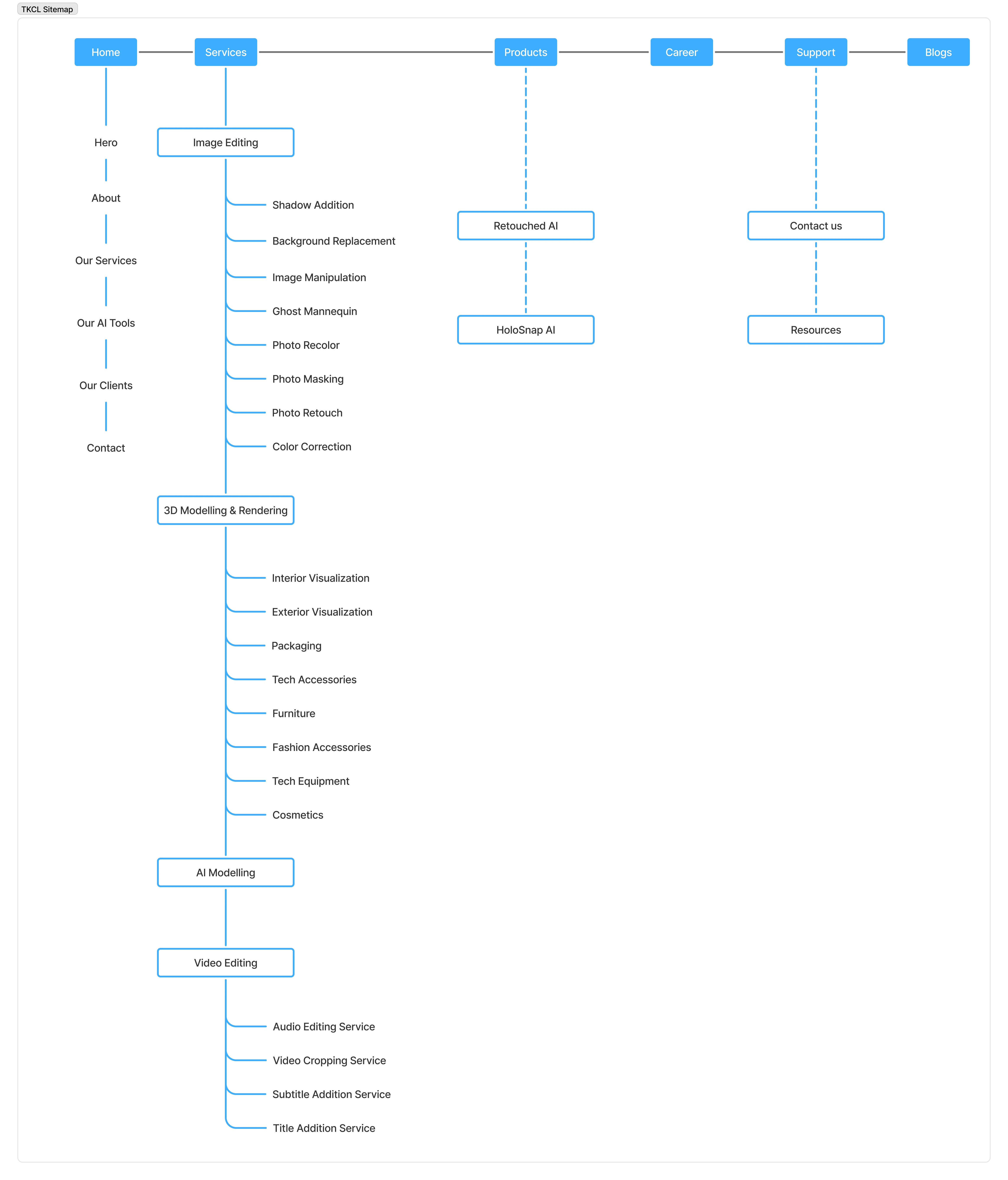
New site architecture — Home, Services (nested), Portfolio, Support. Four pages, zero confusion.
First section — before (cluttered, three competing elements) vs. after (clean service card hierarchy)
The Before & After
Every decision traces back to the data. Here's where the old site was losing and what the redesign changed.
High-Exit Pages
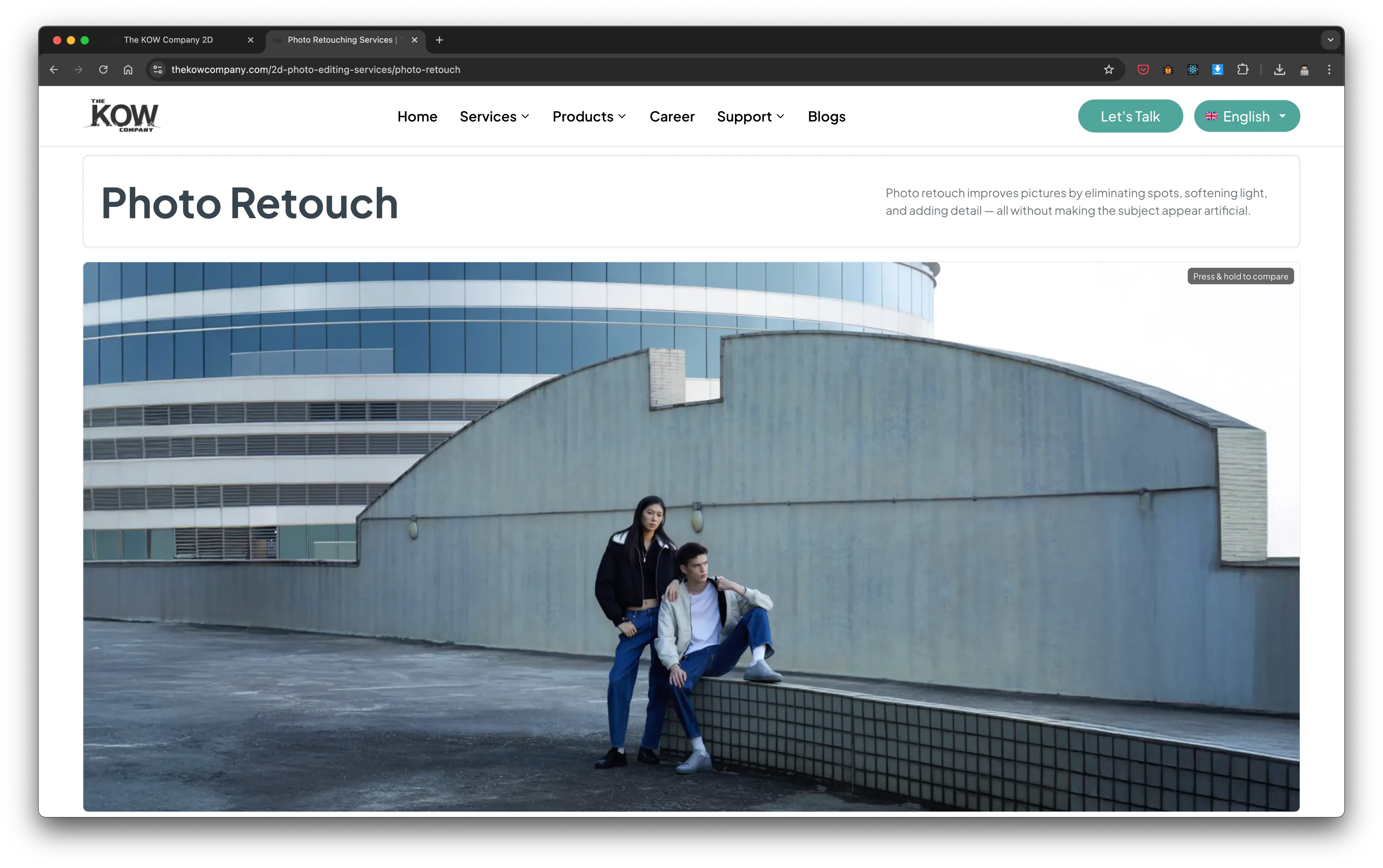
Service Pages — From Exit Point to Conversion Driver
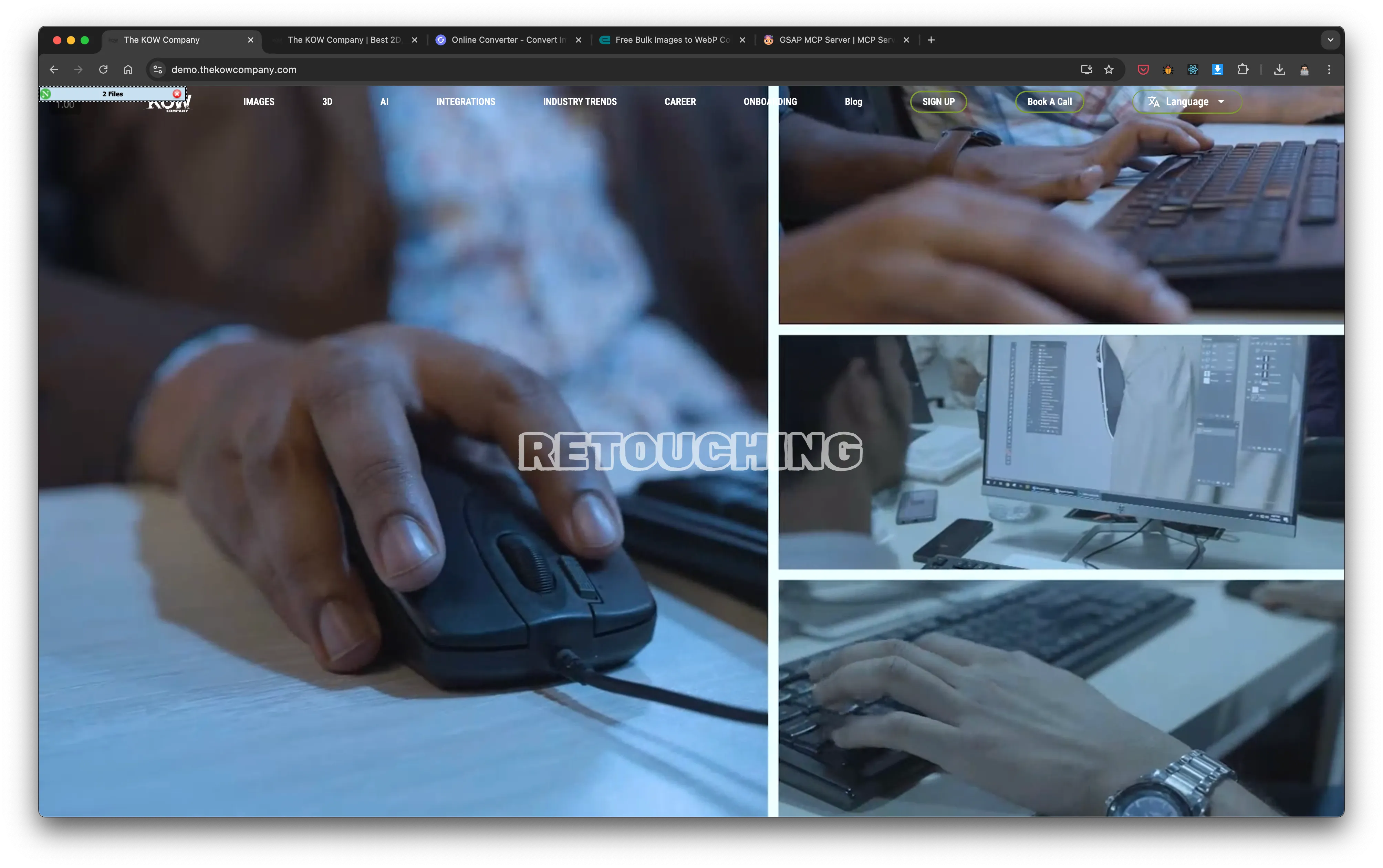
The old service pages had 60% bounce on 2D and 40% on 3D. The culprit wasn't the services themselves — it was that users couldn't find what was relevant to them without reading walls of undifferentiated text. They arrived at the page with a specific need and left when they couldn't quickly match it to what they saw.
Restructured each service page around a clear header, scannable card layout, and a nested sub-page for technical depth. Users who want a quick answer get it. Users who want more can go deeper. No one is forced to read everything to understand anything.
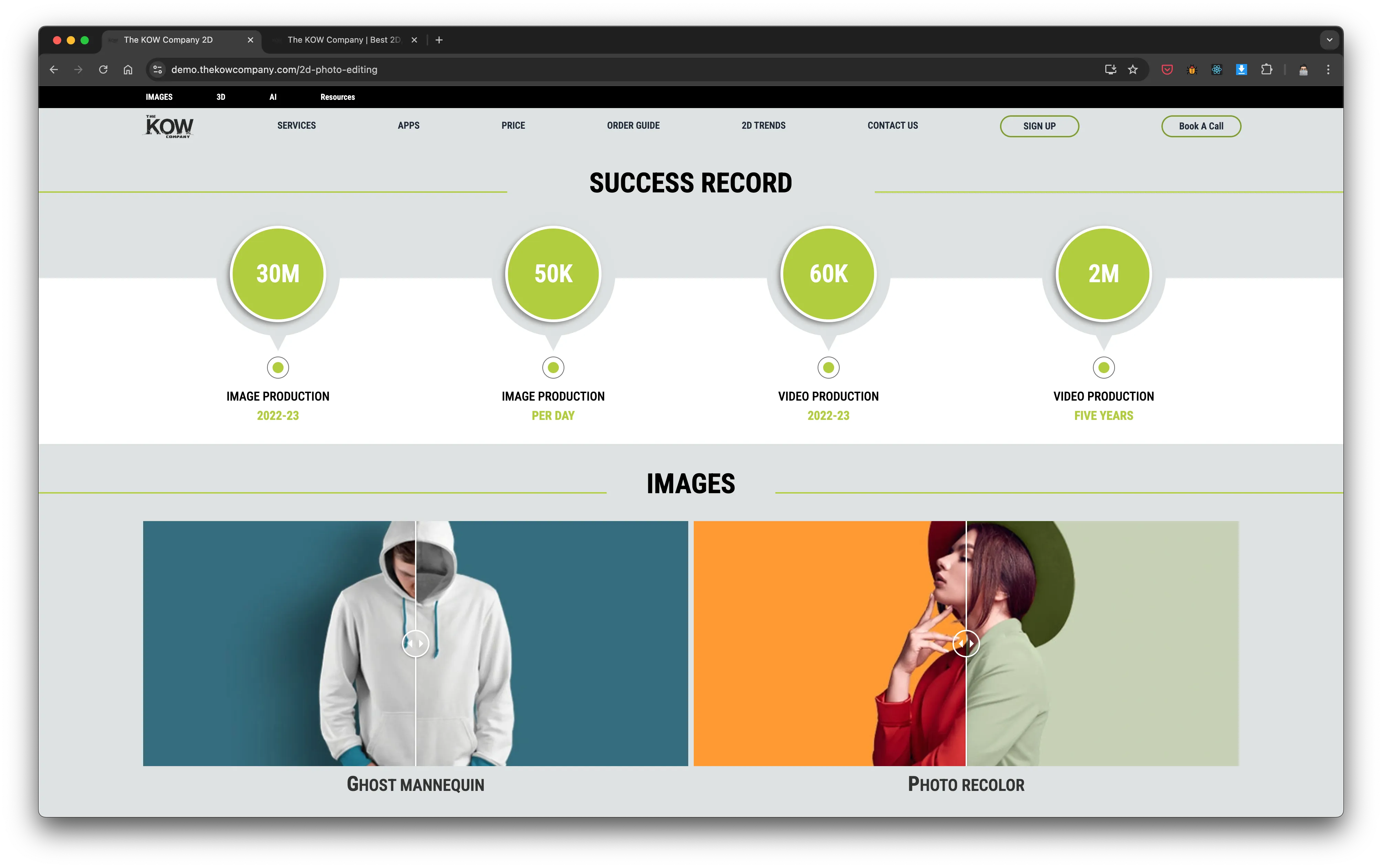
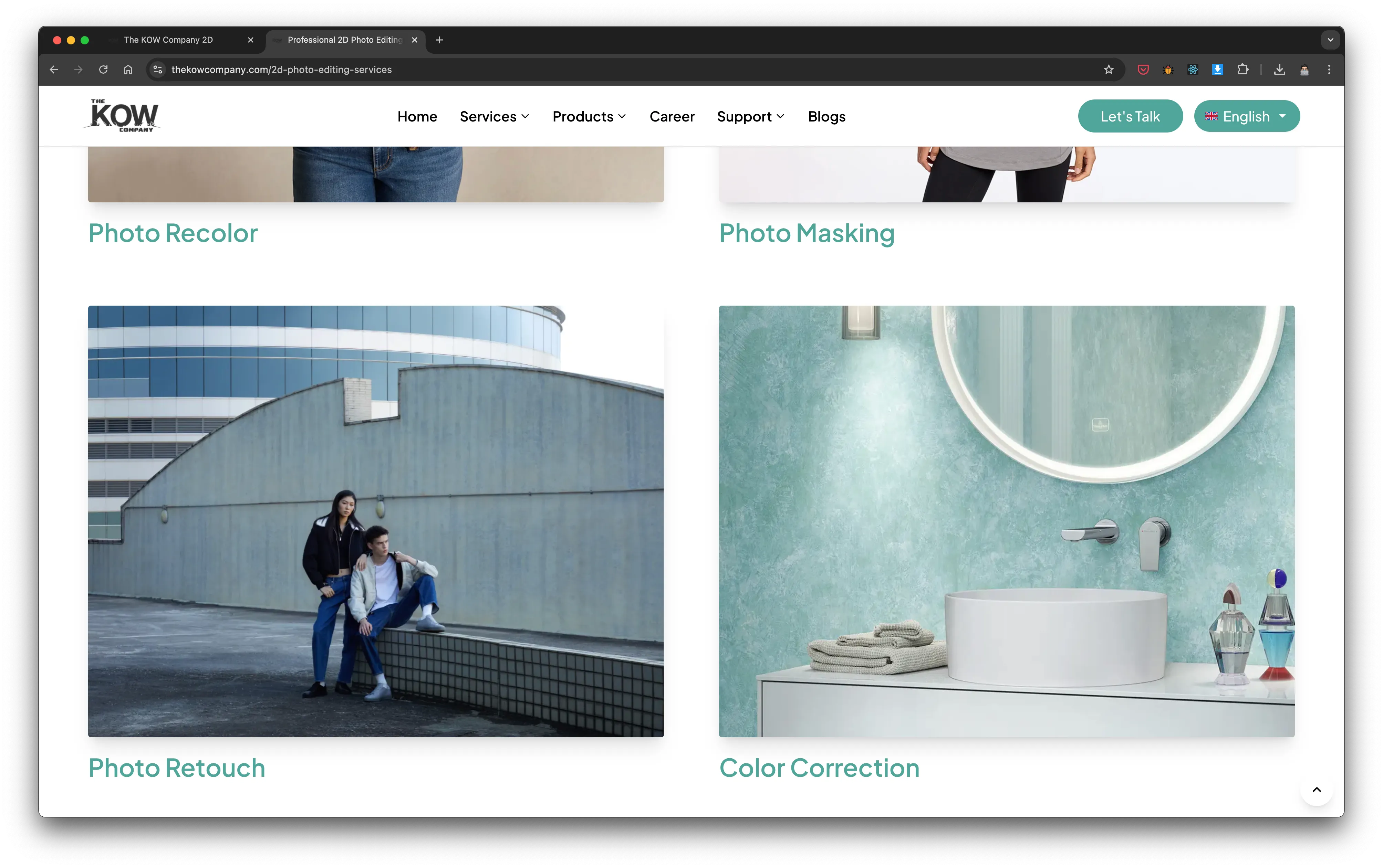
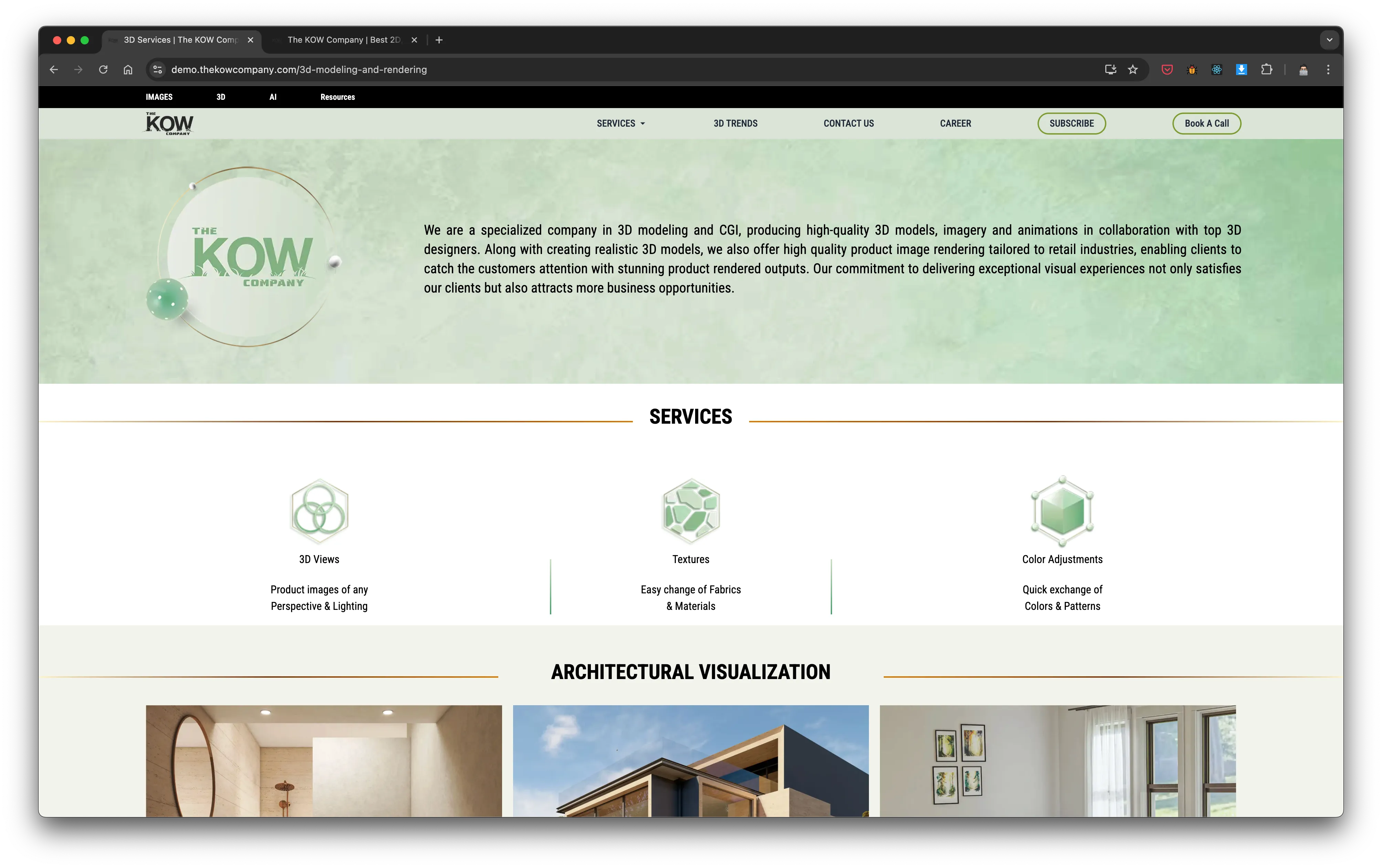
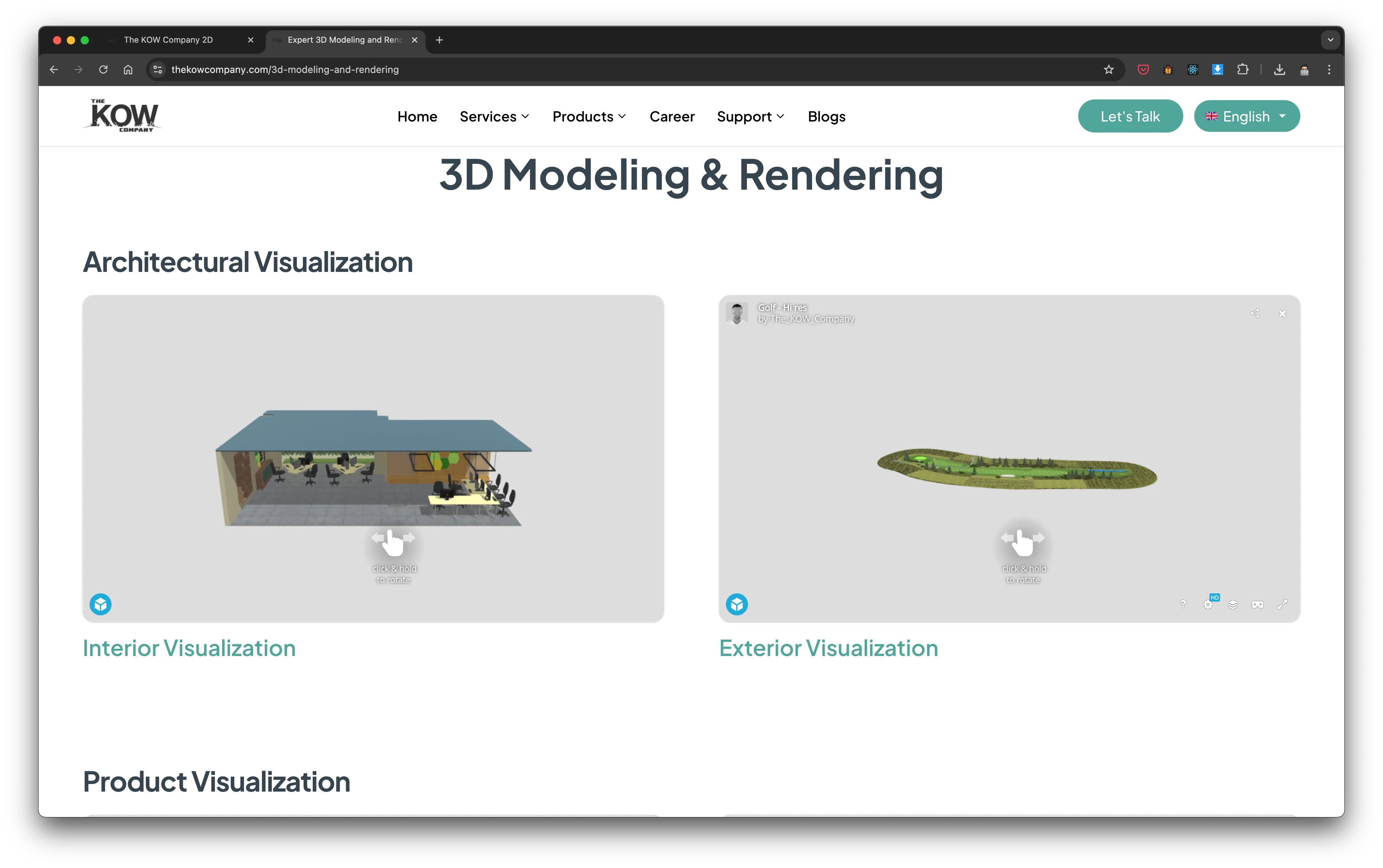
Image Editing and 3D pages — before and after
Conversion Architecture
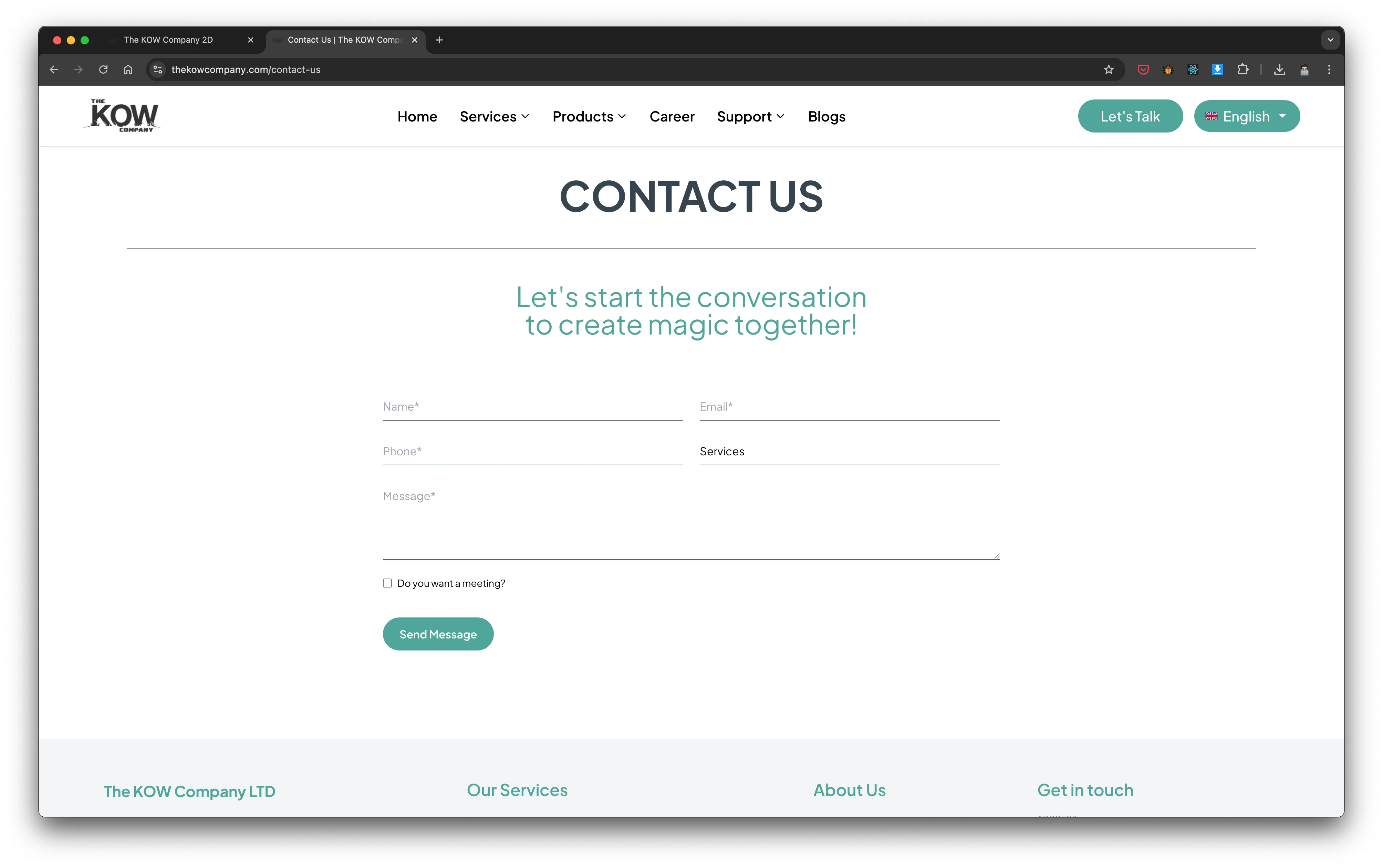
CTA Consolidation & Trust Signals
The old "Book a Call" section had a compelling offer — but the lead-up to it was cluttered. Users had already been fatigued by too many options. By the time they reached the CTA, they'd lost momentum.
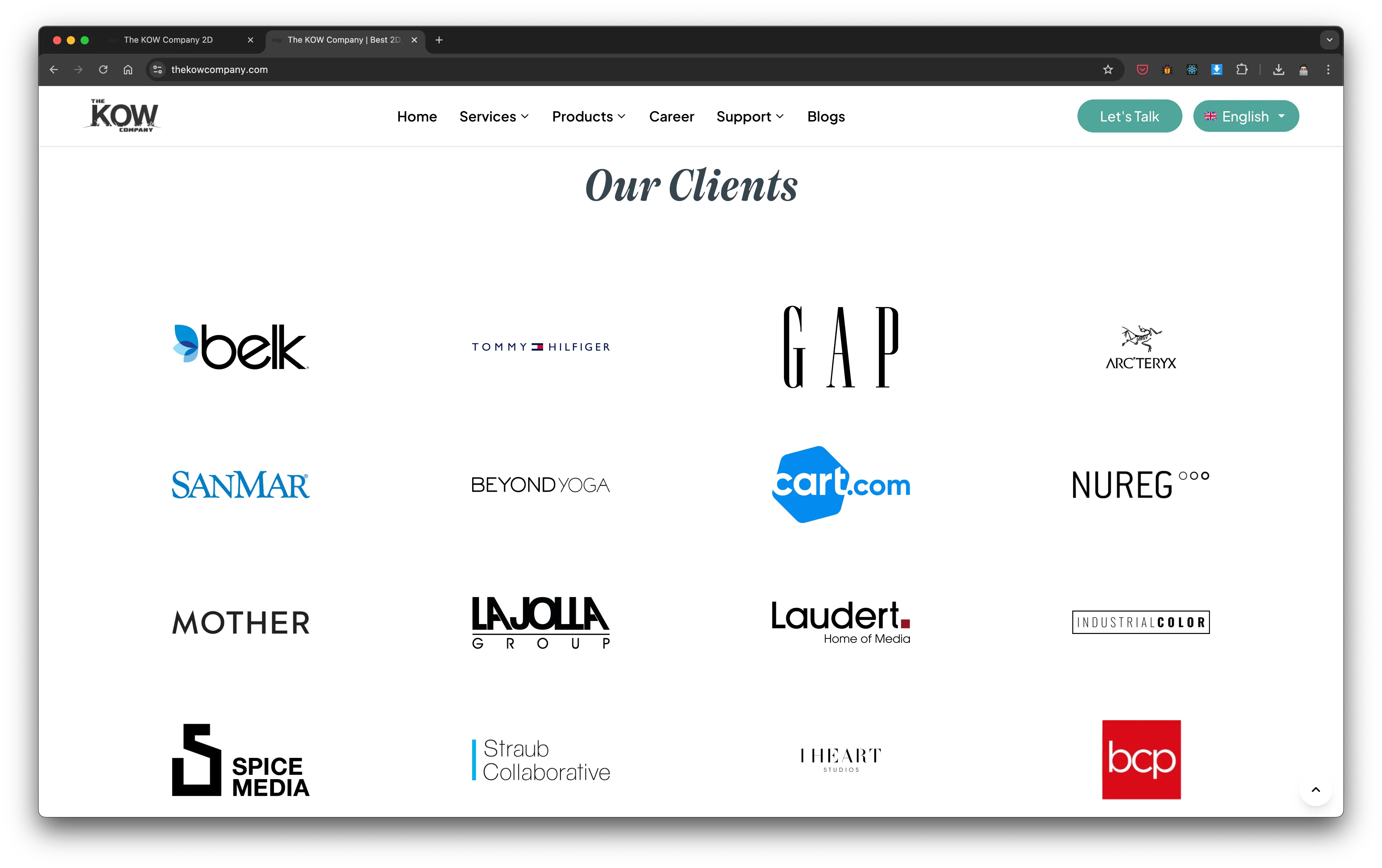
I redesigned the conversion flow so that "Let's Talk" appeared in a consistent position across every page — header, footer, and one mid-page placement — with supporting trust signals (client logos, testimonials) immediately before it. The question a skeptical visitor asks before converting is "why should I trust you?" — the redesign answered that before they had to ask.
Added nested service sub-pages for detailed technical depth — allowing visitors who needed specifics (e.g., exactly what file types are accepted, what retouching standards are used) to find that without it cluttering the top-level page.
CTA consolidation, testimonials, and nested service page detail
Performance & Footer
Footer Redesign & Page Speed
The footer was a low-priority element that got buried in the old design — no links, no structure, no secondary conversion opportunity. I rebuilt it as a functional navigation aid with clear service links, contact info, and a final CTA placement for users who scrolled all the way down.
Page speed was audited and optimized as part of the build. Slow pages lose users before they ever read a word — for a site competing on first impressions, performance wasn't optional.
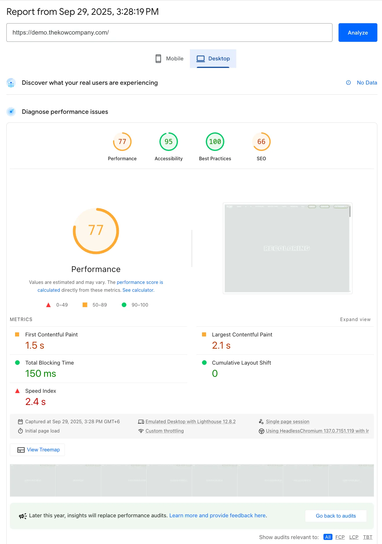
Desktop speed — before
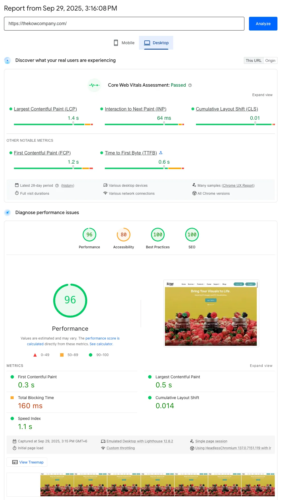
Desktop speed — after
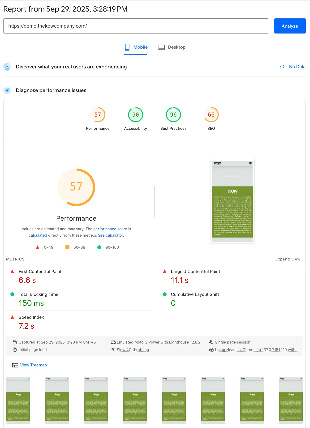
Mobile speed — before
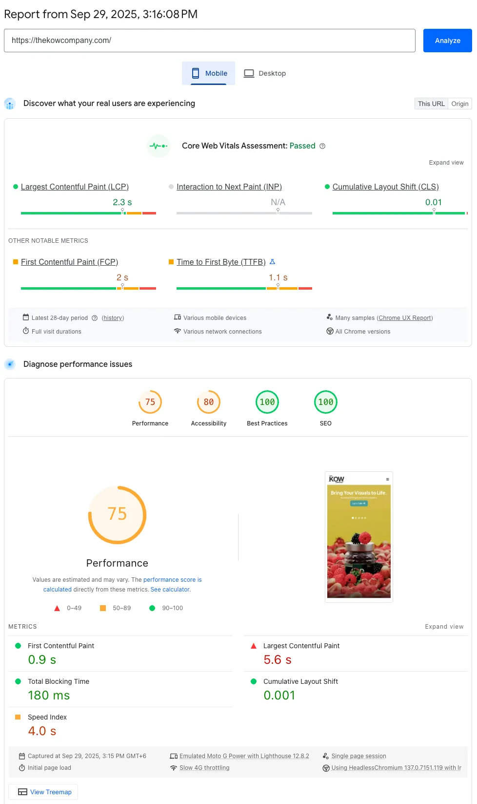
Mobile speed — after
A/B Test: TKCL vs. the Market
After launch, I ran a structured competitive A/B test against the three major competitors — equal traffic, equal time window, same user tasks. The redesigned TKCL site outperformed every benchmark.
| Metric | TKCL (Redesign) | Pixelz | Bright River | bZm Graphics |
|---|---|---|---|---|
| Bounce Rate | 36% | 42% | 39% | 40% |
| Avg. Session Duration | 2.7 min | 2.1 min | 2.3 min | 2.0 min |
| Pages per Session | 3.1 | 2.8 | 2.9 | 2.4 |
| CTA Click-Through Rate | 15% | 11% | 12% | 14% |
| Lead Conversion Rate | 4.3% | 3.0% | 3.5% | 3.8% |
A/B test — equal traffic allocation, four-week window, same conversion tasks across all four sites
Results & Impact
The redesign beat every major competitor across every metric. Not by adding more — by removing everything that was diluting what already worked. Fewer CTAs, clearer services, faster pages, and a conversion path that didn't require users to figure anything out on their own.
Lead Conversion Rate
Best-in-class against Pixelz (3.0%), Bright River (3.5%), and bZm Graphics (3.8%). The result of two focused CTAs instead of six competing ones.
Lowest Bounce Rate
Competitors ranged from 39–42%. Clear service structure and fast load times kept users on the page long enough to convert.
CTA Click-Through Rate
Highest CTR in the test. "Let's Talk" performed 25–36% better than competitors' multi-CTA setups. Simplicity converted.
Average Session Duration
Users spent more time on the site than any competitor — exploring services, reading testimonials, and moving toward conversion at their own pace.