SFU Snap App
A solo redesign of Simon Fraser University's student companion app — crashed constantly, logged users out randomly, and made finding a classroom feel like a UX puzzle. I fixed all of it.
SFU Snap was built by students, for students — but somewhere along the way it stopped working for them. Crashes mid-session, random logouts, no clear information hierarchy, and an interface that hadn't evolved with the students using it. I ran the full redesign process solo: research, personas, journey mapping, wireframes, design system, and high-fidelity prototype. Every decision backed by real user interviews.
The Problems
- Frequent, unprompted session logouts
- App crashes during normal usage
- Unreliable, inconsistent interface patterns
- No clear information architecture or navigation logic
- No central dashboard — every module siloed
Key Results
- 40% reduction in task completion time
- 2.1 → 4.3/5 user satisfaction score
- Navigation confusion eliminated across all tested tasks
- Complete redesign: research → hi-fi prototype in 4 months
Role
UX/UI Designer (Solo Project)
Timeline
4 Months
Tools
Figma, Miro, iPad (wireframes)
Process
Stanford d.school Design Thinking
Empathize Before Redesigning
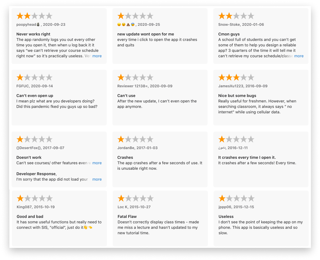
The temptation on a solo project is to jump straight to Figma with assumptions about what's broken. I didn't. I interviewed real SFU students — through Instagram stories and in-person sessions on campus — to hear exactly what was failing and why.
HOW MIGHT WE: make SFU Snap feel as reliable as a native iOS app? How might we redesign an app that students have written off so they actually want to use it daily?
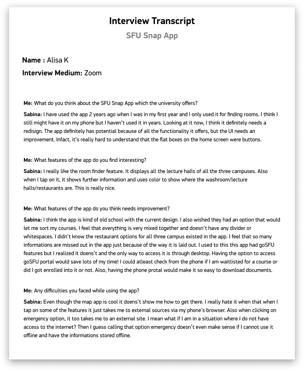
User Interviews — What Students Actually Said
"The app keeps crashing when I try to check my schedule. The interface is confusing and I can never find what I'm looking for."
"I use the app daily but it's unreliable. It logs me out randomly and I have to restart everything. The design feels outdated compared to other apps."
The Design Thinking Framework
I structured the entire project around the Stanford d.school Design Thinking Process — not as a formality, but as the actual method. Empathize → Define → Ideate → Prototype → Test. Each phase built on the last and fed back into the earlier ones.
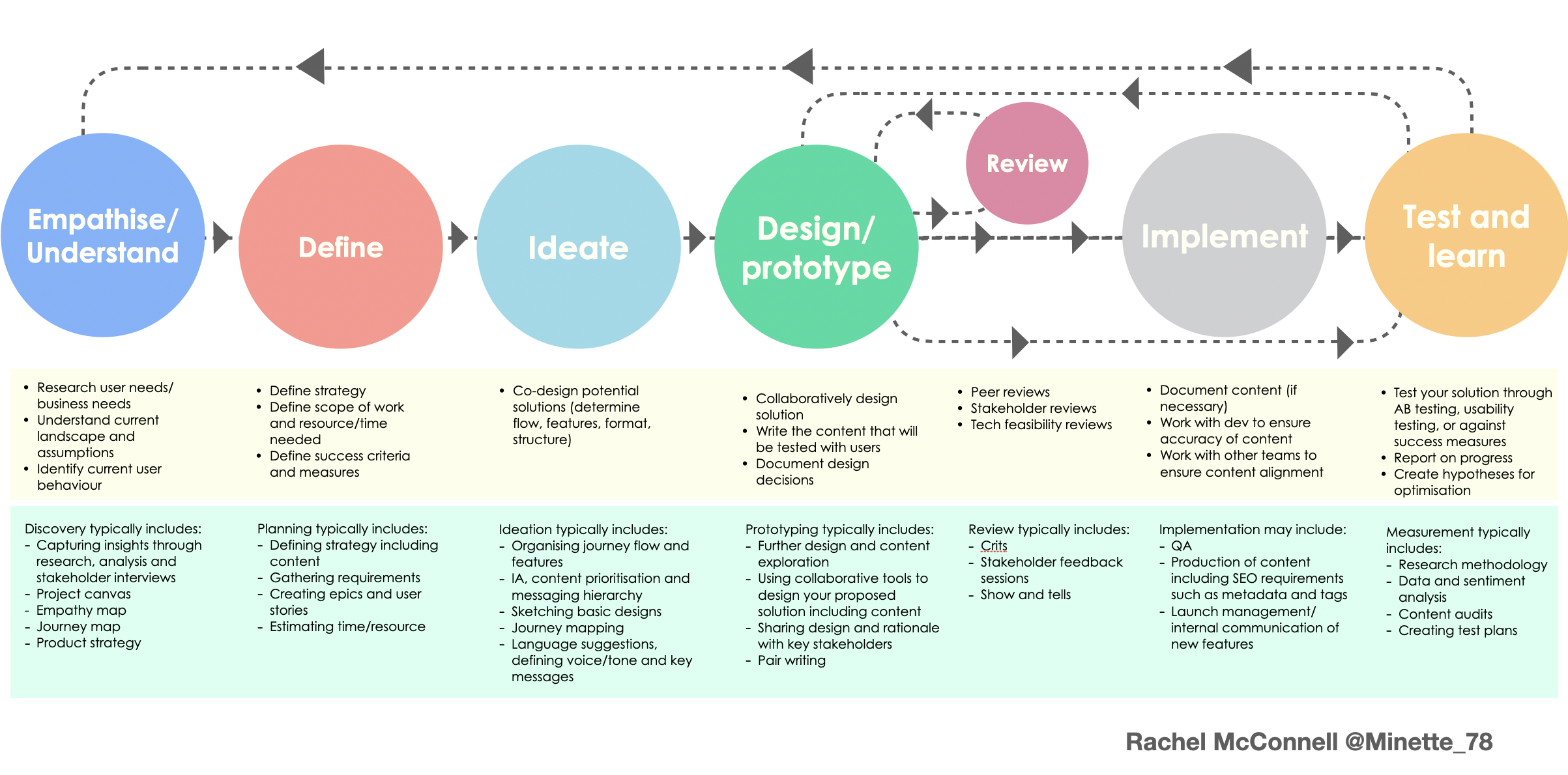
Design Thinking process applied to this project
Research Plan
Instagram stories for broad signal, in-person interviews for depth. I created empathy maps, personas, user stories, and journey maps — not to check boxes, but to build a shared reference point I could keep returning to when making design decisions.
Full research plan and methodology
Define — Turning Interviews Into Direction
Interviews are raw data. The work is turning them into something actionable. I built two full personas (Sabina and Alisa), paired them with empathy maps, wrote problem statements for each, and mapped out the user journey to identify exactly where the app was breaking trust.
The core finding: students weren't failing because the features didn't exist — they were failing because nothing was where they expected it, and the app gave them no confidence that it would stay working.
User Interviews
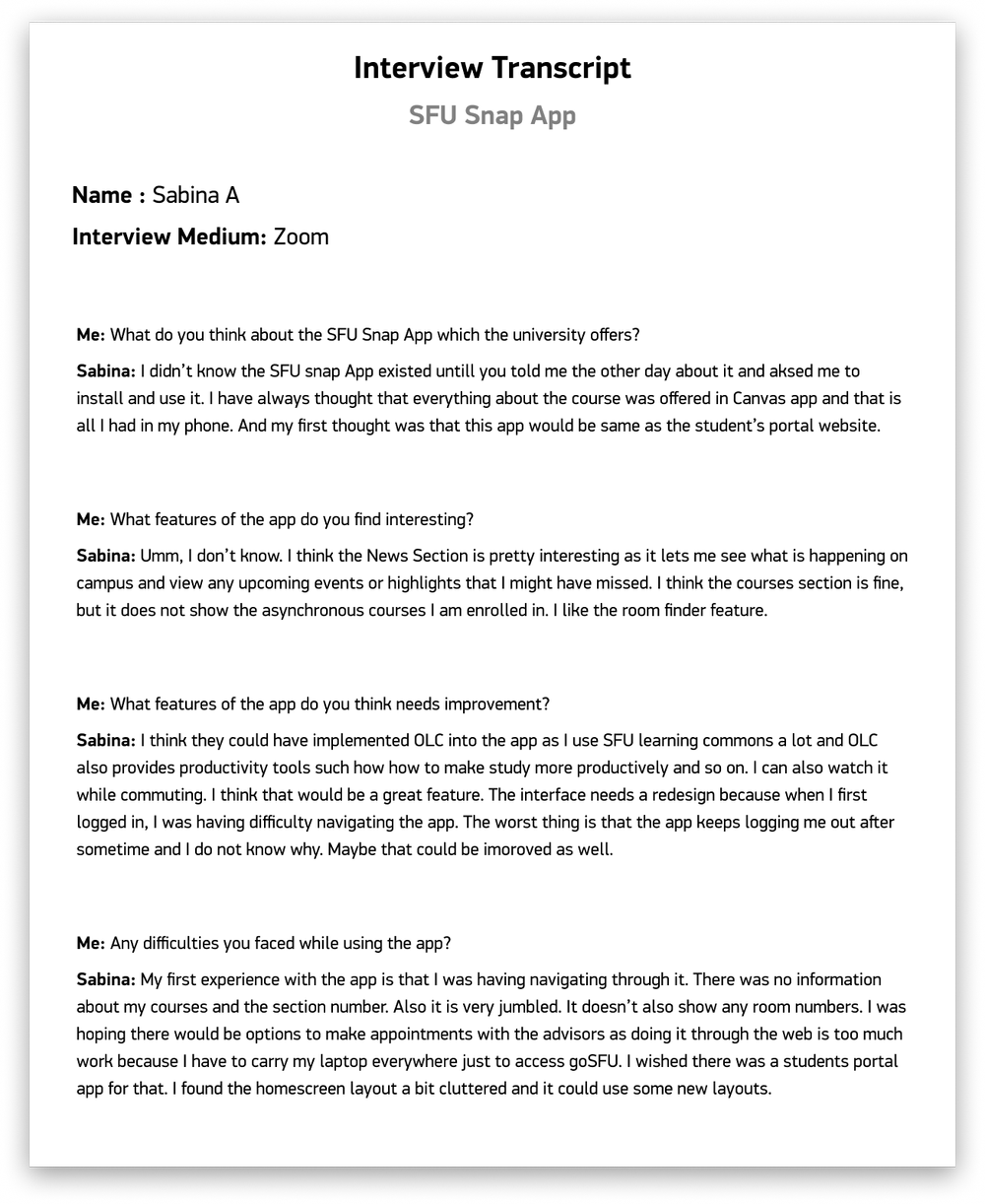
Sabina & Alisa — in-person interview artifacts
User Personas
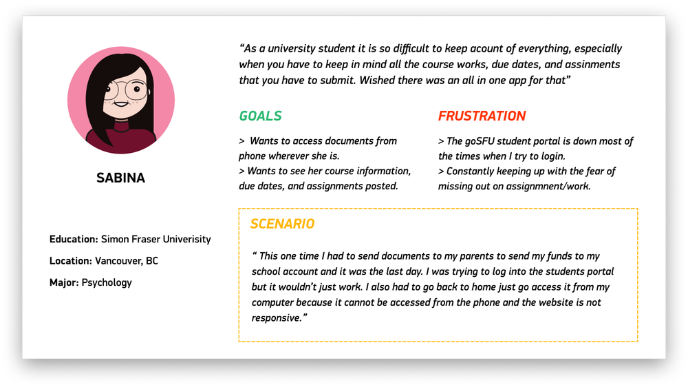
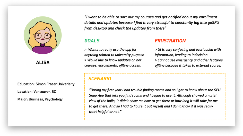
Personas built from interview synthesis — goals, frustrations, context
Empathy Maps
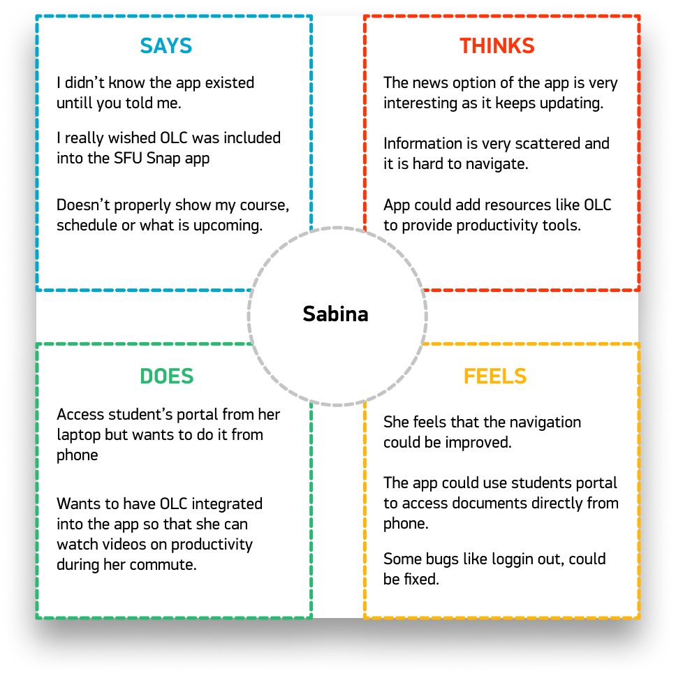
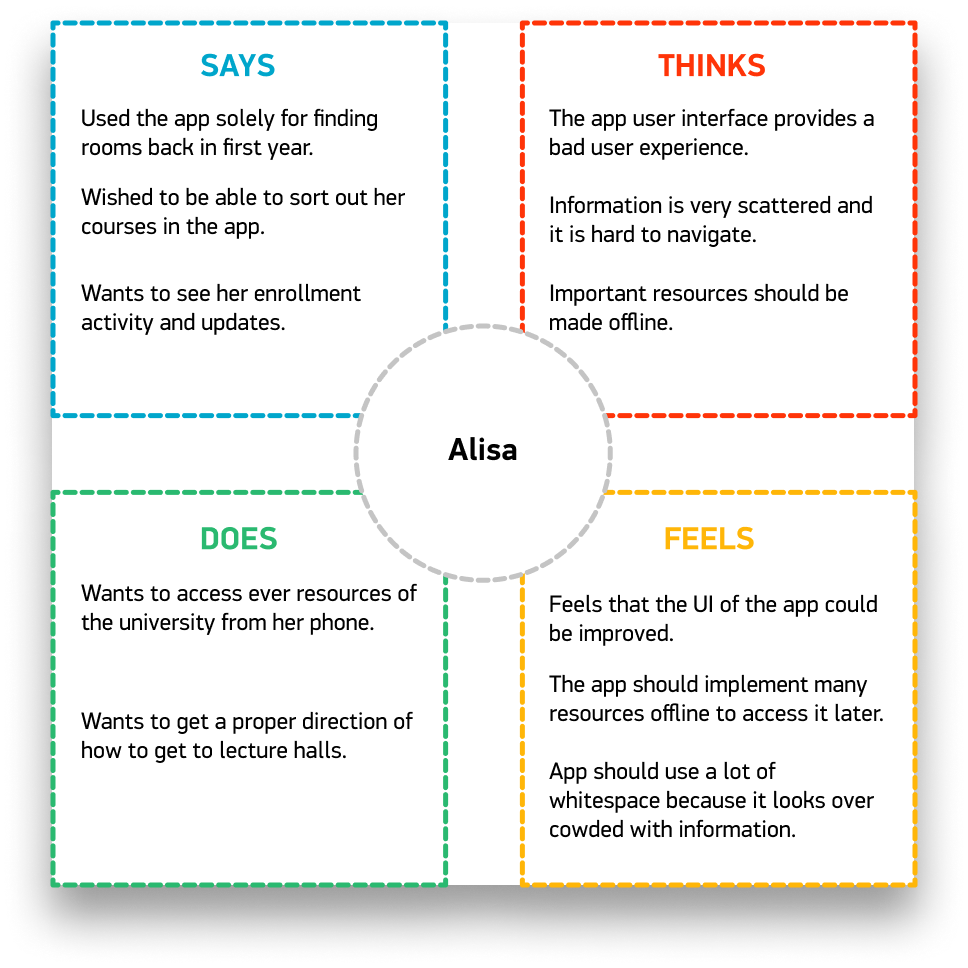
Say, Think, Do, Feel — mapped per user
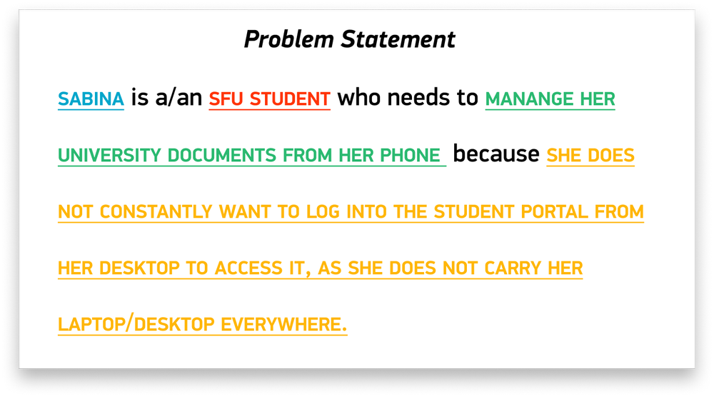
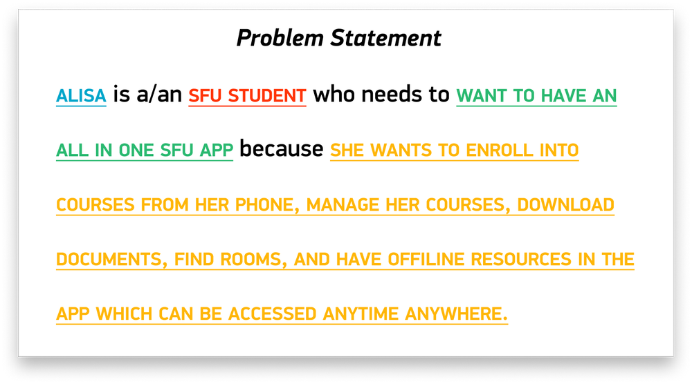
Problem Statements
Strategic Design Shifts
From user journey map to goal statement to wireframes — each step answered a specific question the research raised.
Key Shift One
Map the Journey, Then Set the Goal
Before designing anything, I mapped the full user journey — not the ideal flow, but the actual one. Where did students go? Where did they get stuck? Where did they give up? The map made clear that there was no logical starting point — every module was effectively a dead end with no connection to the others.
The goal statement that came out of this was direct: design a centralized dashboard where every module is one tap away, with consistent navigation patterns throughout.
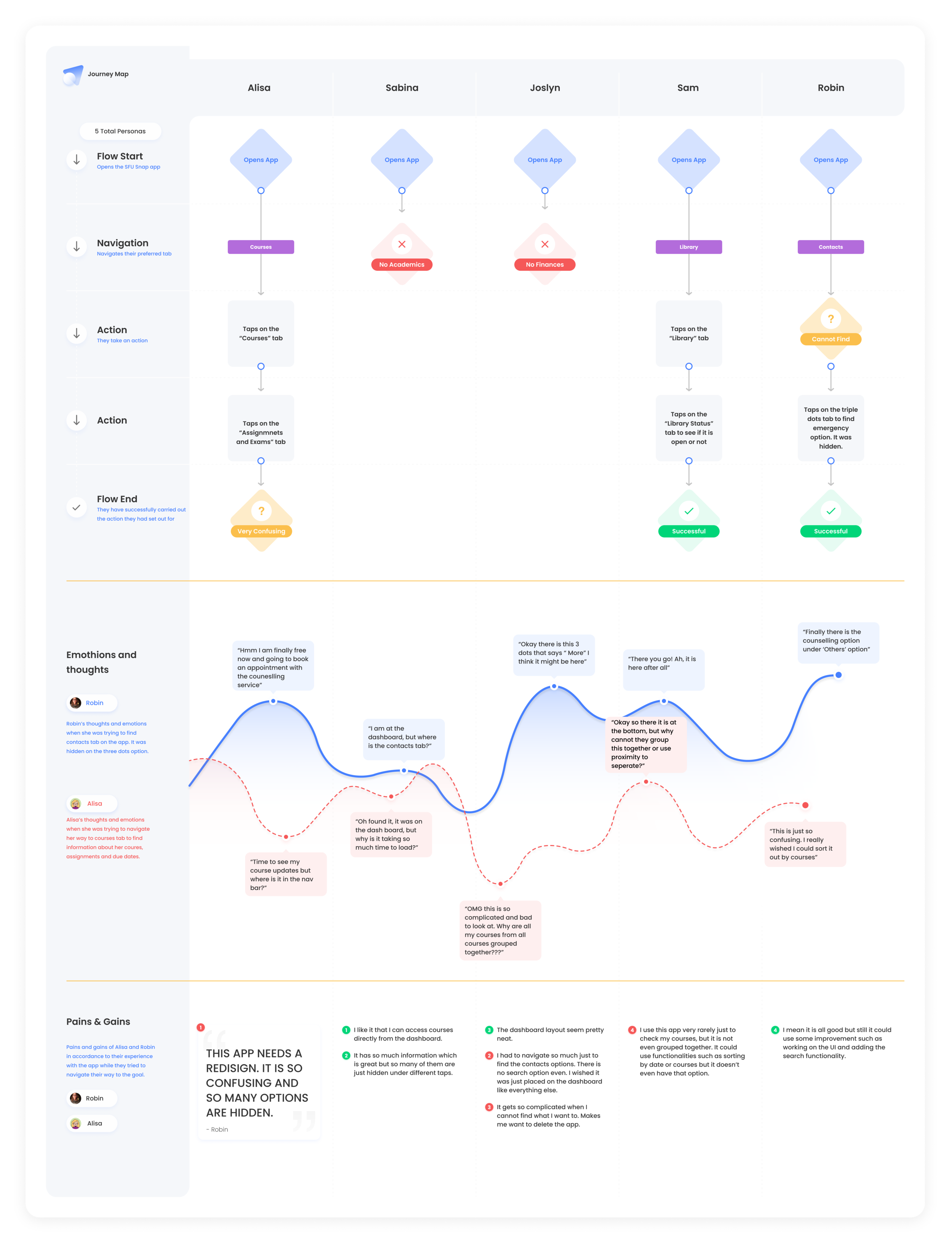
User journey map — full experience from open to exit
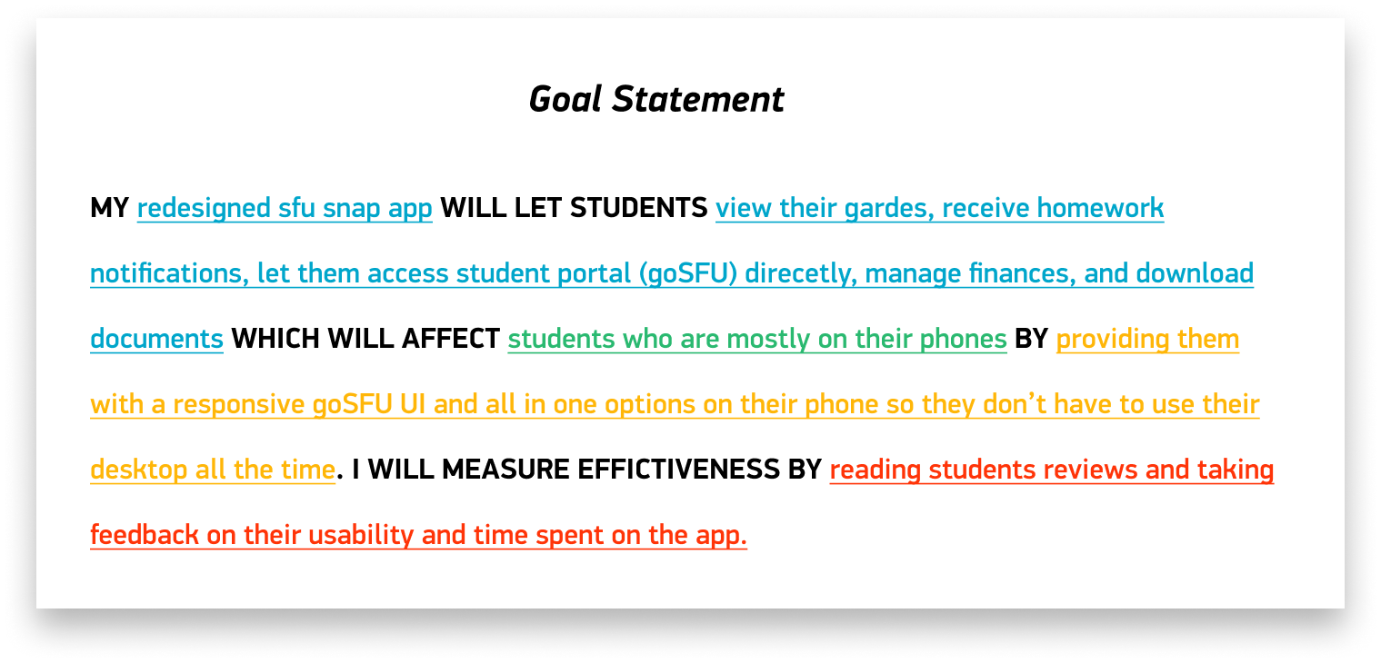
Goal statement — the design target in one sentence
Key Shift Two
Information Architecture First, Visuals Second
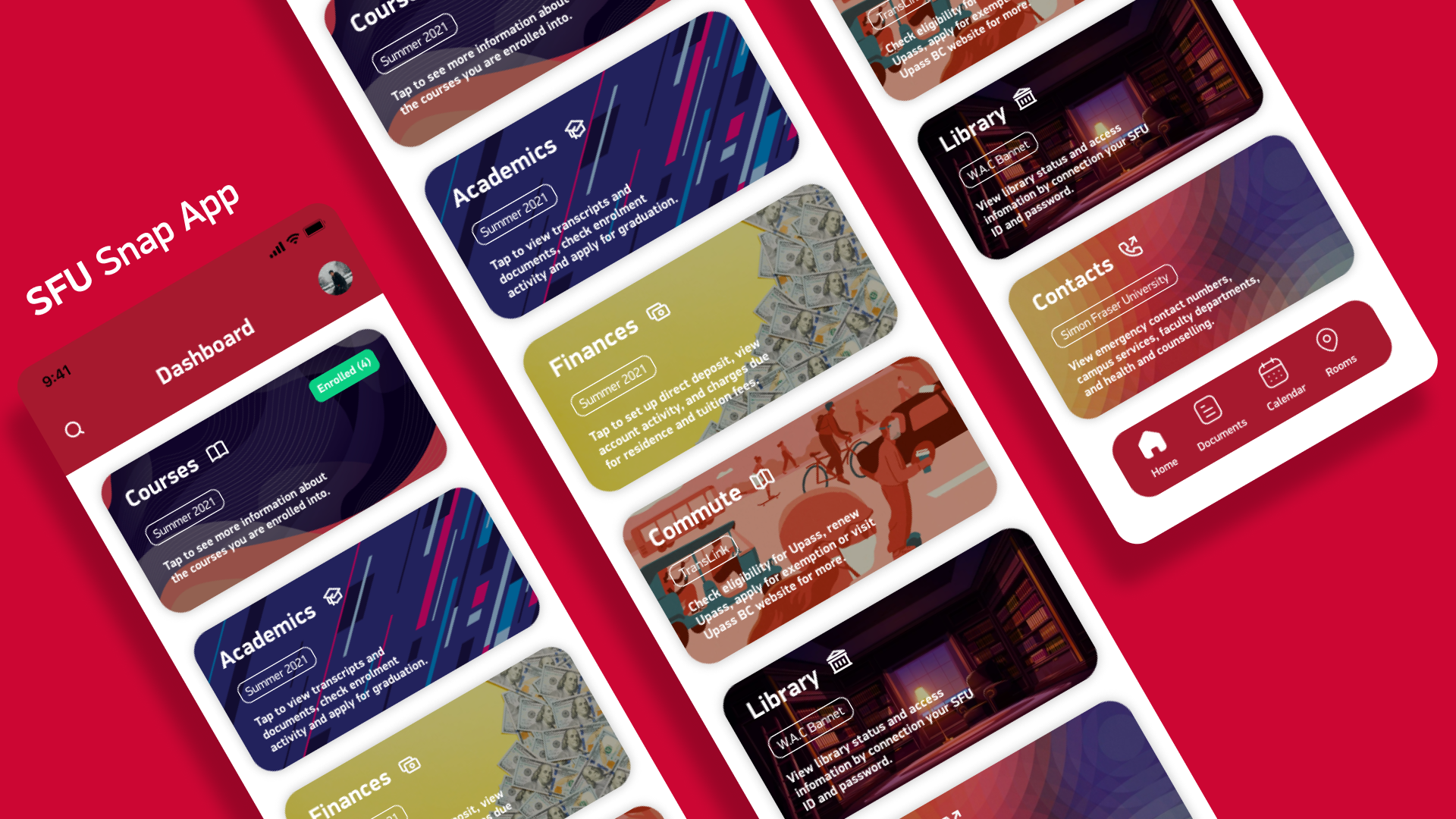
The old app had no clear IA — modules were scattered, navigation was inconsistent, and the "home" screen wasn't actually a home. I restructured the entire hierarchy around a central dashboard that surfaced the four most-used modules immediately: Schedule, Map, Transit, and Services.
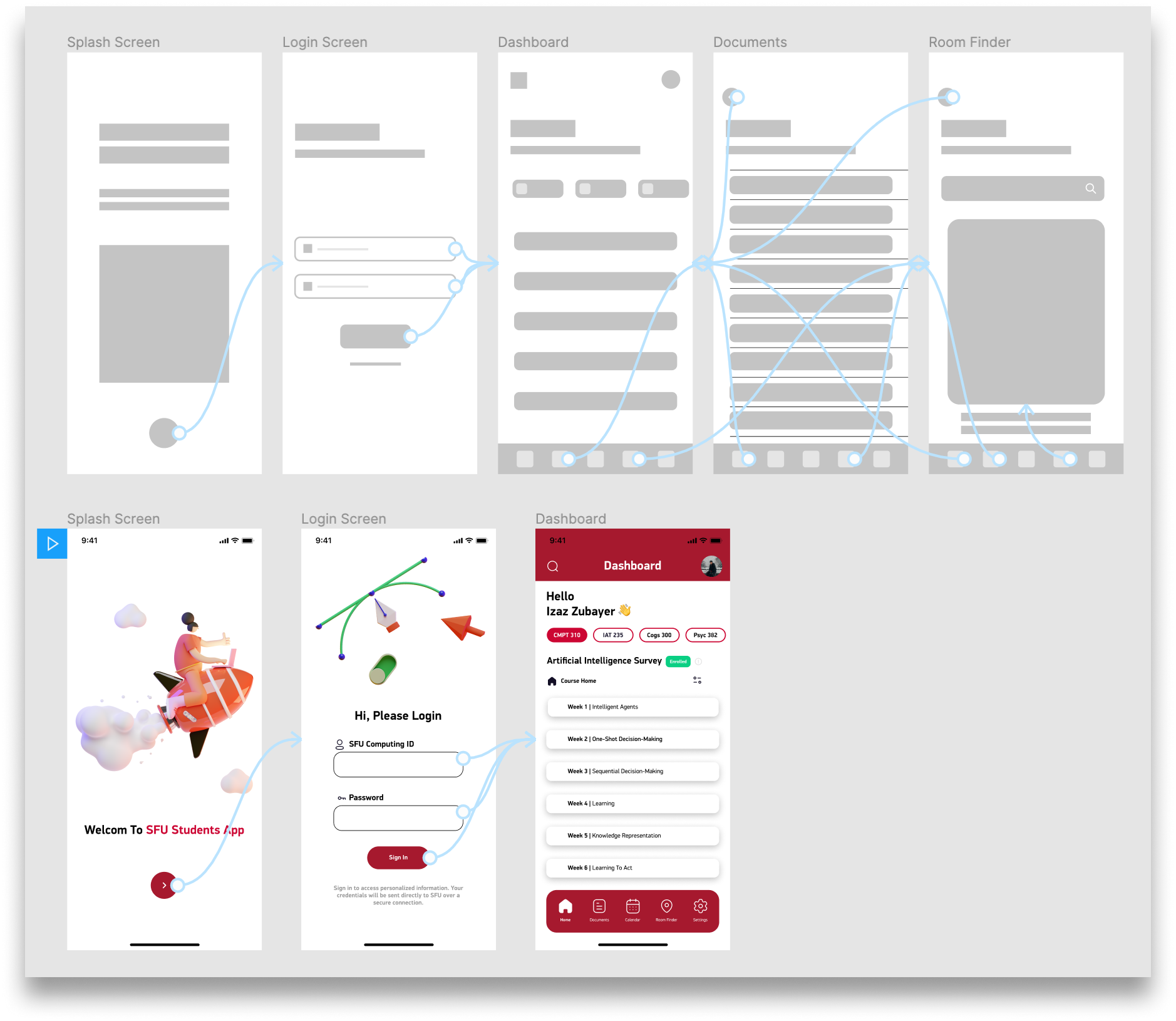
I wireframed first on iPad (fast, non-precious, easy to throw away), moved to Figma lo-fi to test flows, then iterated into high-fidelity once the architecture was validated with users.
Paper → Lo-fi → IA diagram → Hi-fi. Each stage had a specific question it was answering. No stage was skipped just to get to the visual work faster.
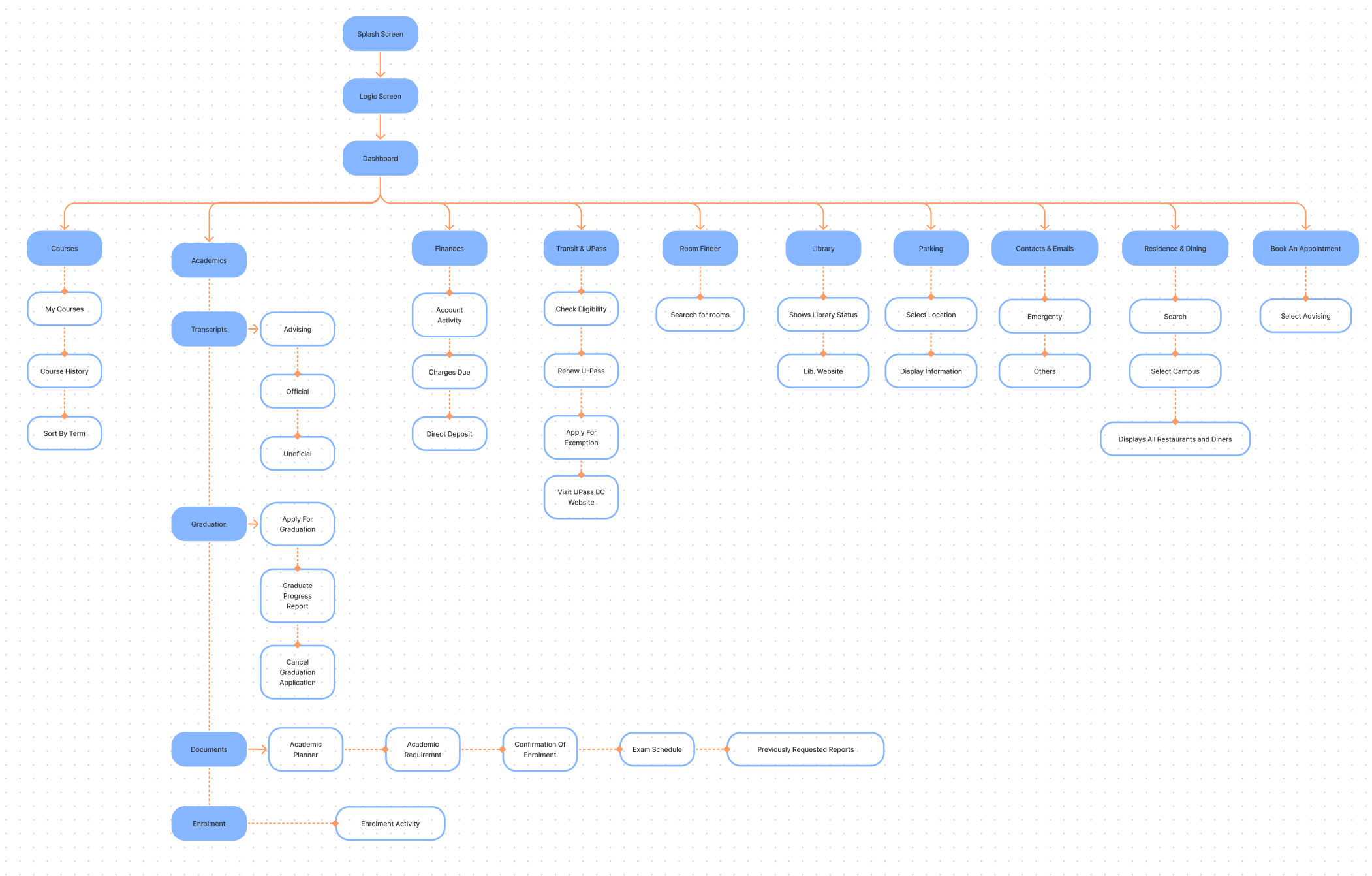
Information architecture — full app structure
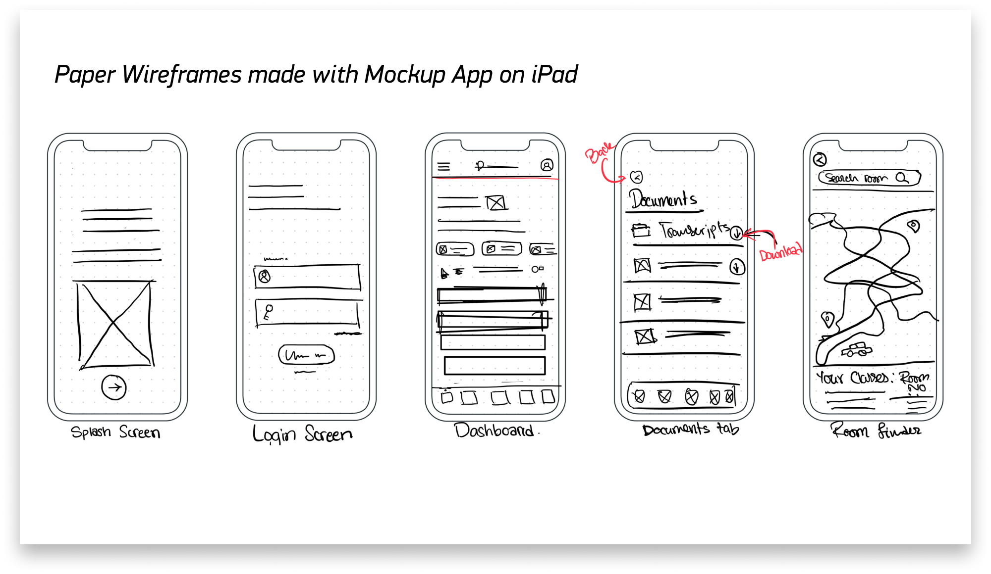
iPad sketches
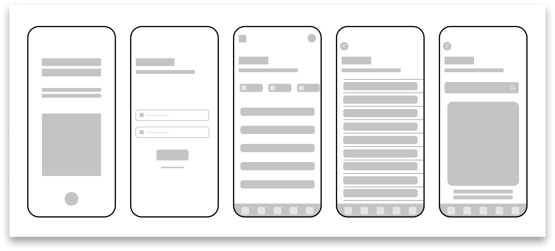
Lo-fi Figma prototype
Key Shift Three
Build on SFU's Design Language, Don't Replace It
I made an early decision not to reinvent the visual language from scratch. SFU has an established design library — typefaces, colors, component patterns. I built the system on top of that and extended it with custom app-specific icons and patterns the existing library didn't cover.
This decision made the redesign feel like an evolution, not a replacement — which was the right call for an institutional app used by students who already had some muscle memory with the SFU visual brand.
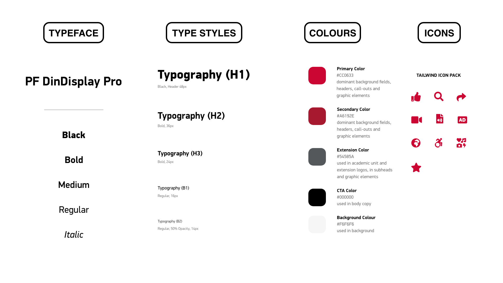
Design system — type, color, icons, components
High-fidelity Figma prototype — full interactions
Final Design & Prototype
The hi-fi prototype went through usability testing with 7 SFU students (2 moderated, 5 unmoderated). Task completion time dropped 40%. User satisfaction went from 2.1 to 4.3 out of 5.
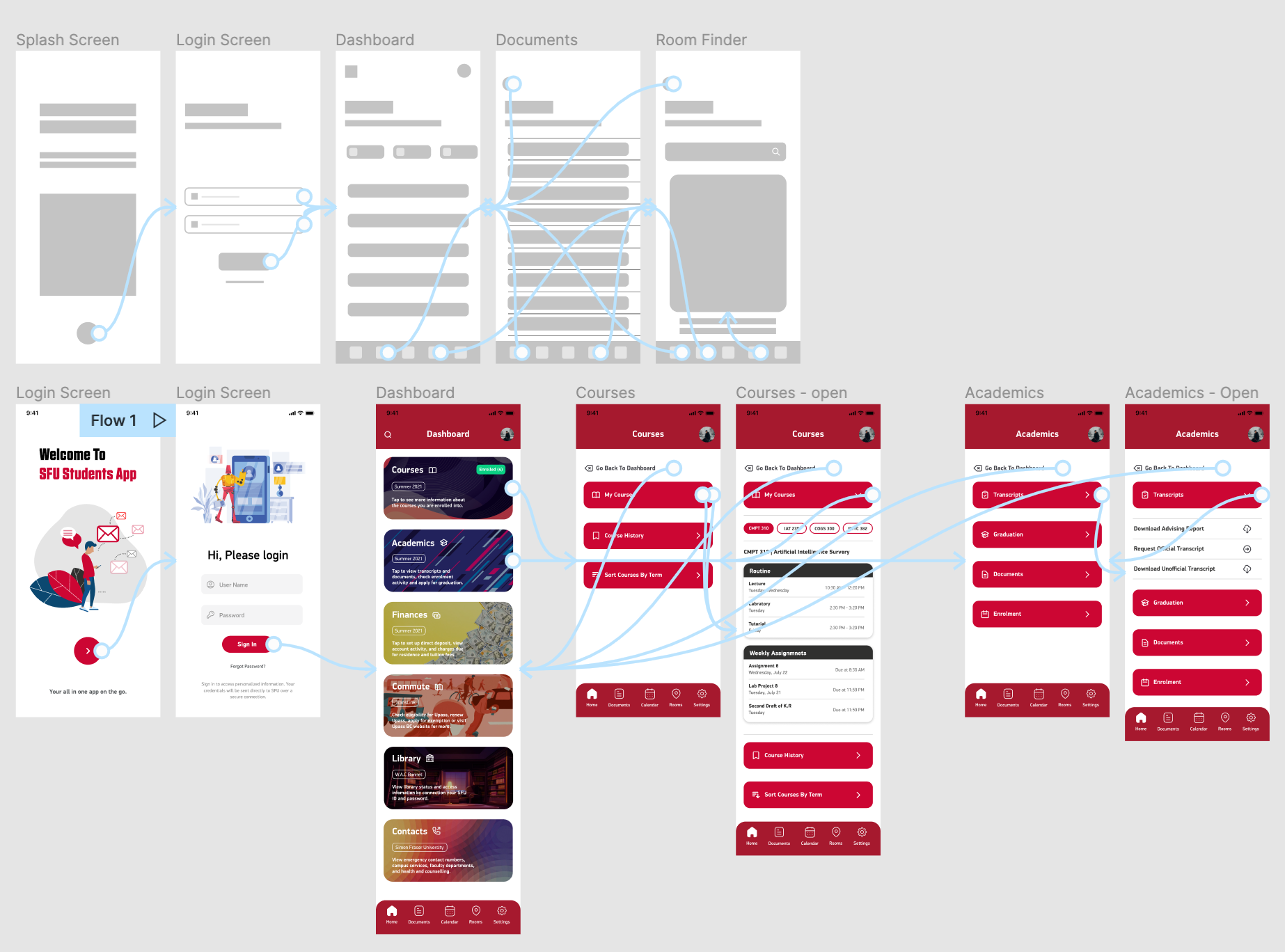
Redesigned dashboard — every module, one tap away
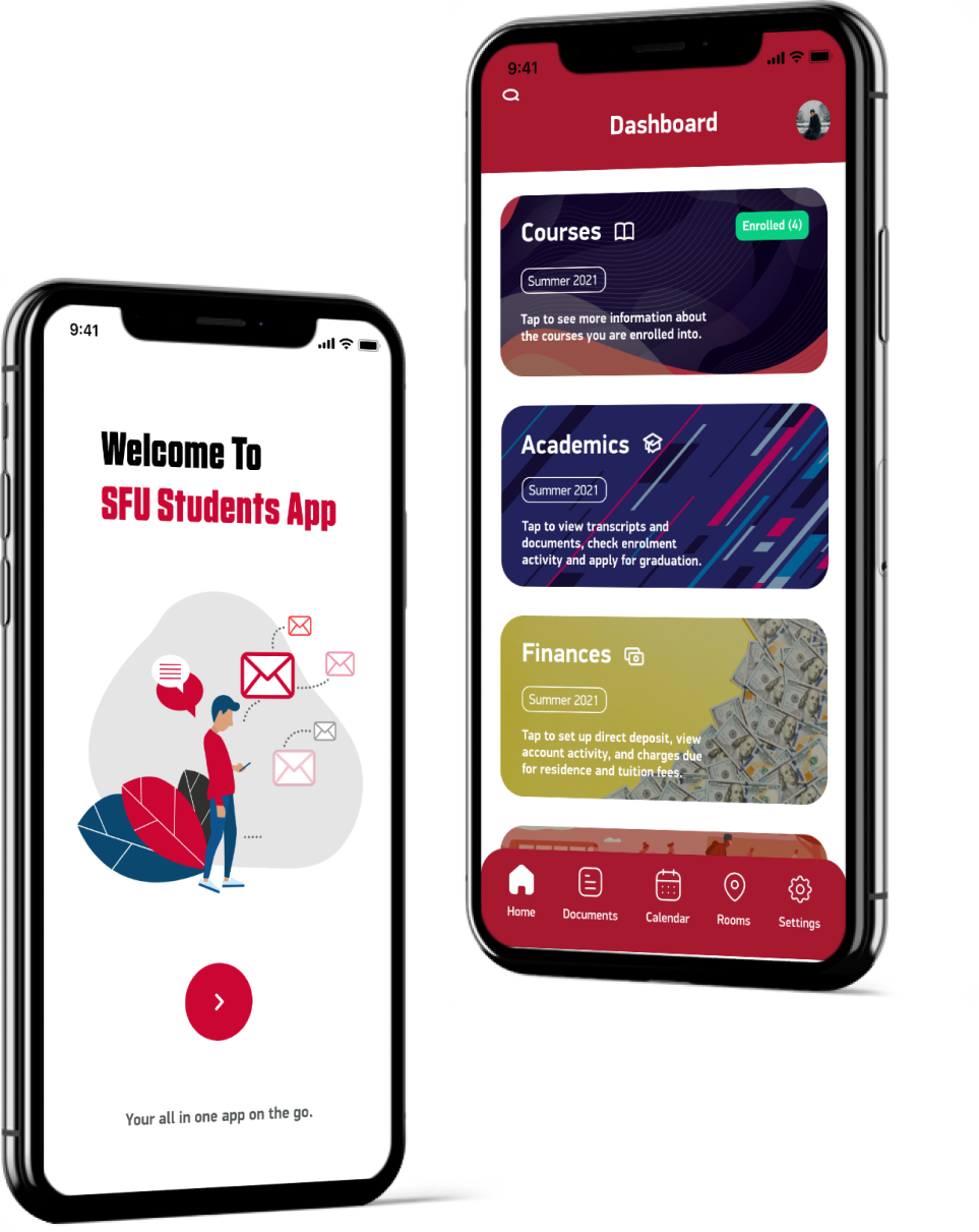
Full hi-fi prototype screens — course schedule, map, transit, dining, parking
Prototype Walkthrough
Results & Impact
Seven students. Two days of testing. The redesign passed every task the old app was failing. Real users, real improvement — not hypothetical metrics from a design doc.
Faster Task Completion
Students found what they needed significantly faster with the redesigned navigation — centralized dashboard, consistent module access, no dead ends.
User Satisfaction
Up from 2.1/5 on the original app. The jump wasn't from adding features — it was from making existing features findable and the interface feel reliable.
Navigation Confusion Events
Every test participant completed every task without getting lost. That number was non-zero before. Eliminating confusion was the single most impactful outcome.
Full Process, One Person
Research, synthesis, IA, wireframes, design system, hi-fi prototype, usability testing — end to end. Every role a UX team would split across 4 people.