SentriMorph
A Bangladesh-based cybersecurity company website — designed and shipped in 22 days.
SentriMorph had the technical credibility. What it didn't have was a way to communicate that to the right people — CTOs in Norway navigating GDPR compliance, and fast-moving founders in Bangladesh who couldn't afford to get it wrong. The brief was a website. The real problem was trust.
The Gap
78% of the 32 decision-makers we surveyed said "generic marketing jargon" was their biggest frustration with cybersecurity vendors. CrowdStrike walls you off behind a sales call. Palo Alto dumps 400 pages of navigation on you. The gap wasn't capability — it was communication.
Key Results
- 22 days from brief to fully shipped live website
- Figma → AI agent → Tailwind design-to-code pipeline
- 5 full pages with nested service pages, component library, and content strategy
- Trust-First positioning that outperformed CrowdStrike & Palo Alto on clarity
Role
Product Designer & UX Writer
Timeline
22 Days
Tools
Figma, Framer, Adobe Illustrator, AI Agent
Research First — Then Design
Before opening Figma, I ran structured research across two very different markets: Norway (enterprise, compliance-driven) and Bangladesh (growth-focused, speed-driven). 32 decision-makers. Two distinct contexts. One shared frustration — every cybersecurity vendor sounds the same.
HOW MIGHT WE: make a cybersecurity vendor feel like a partner — not a product? How might we communicate technical depth without triggering jargon fatigue in the first 10 seconds?
What the Research Told Us
78% of decision-makers cited "generic marketing jargon" as a major turn-off. 65% said cybersecurity sites rely too heavily on fear-mongering. 82% of Bangladeshi respondents prioritized localized communication over technical specs. The brief was to build a site — the insight was to build trust.
Competitive Analysis: Where Everyone Else Failed
The opportunity was clear: be the vendor that actually answers the question before it's asked.
Strategy: Trust-First, Not Feature-First
Based on the research, I made the foundational strategy call: SentriMorph would lead with outcomes and clarity, not technology lists. Every headline needed to answer "so what?" immediately. Every service description needed to speak to a CTO on a bad day — not to someone who already knows what penetration testing means.
Visual Direction: Dark UI, Red Accents, and Radical Clarity
The visual direction wasn't arbitrary. Dark backgrounds create an immediate sense of professionalism and authority — which matters when your client is a CTO about to hand you their infrastructure. Red accents communicate vigilance and alertness without relying on fear.
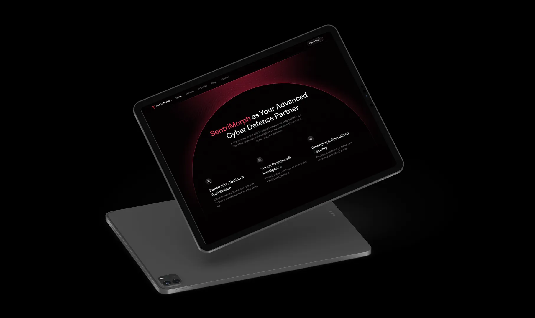
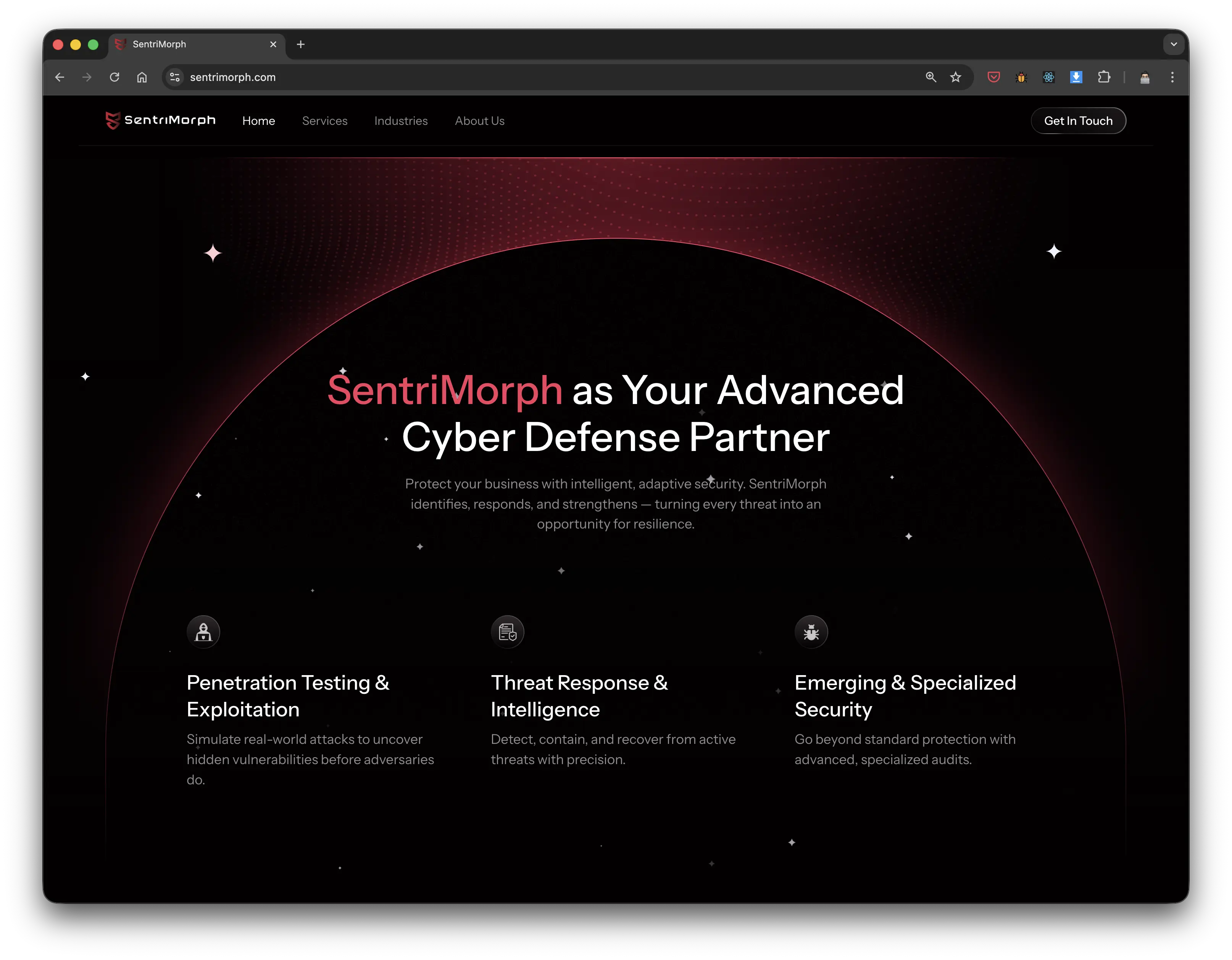
The UX writing decision was equally deliberate: replace every tech buzzword with a direct outcome. "Next-Gen AI-Driven Threat Vector Analysis" became "We stop breaches." The hero headline — "Every click is an entry point. We close every one of them." — was written to capture two things at once: vulnerability and reassurance, in a single breath.
Information architecture used progressive disclosure throughout — broad at the top, deep on demand. Accordions for industry segments. Nested service pages for technical depth. No one needs to read everything; everyone gets exactly what they came for.
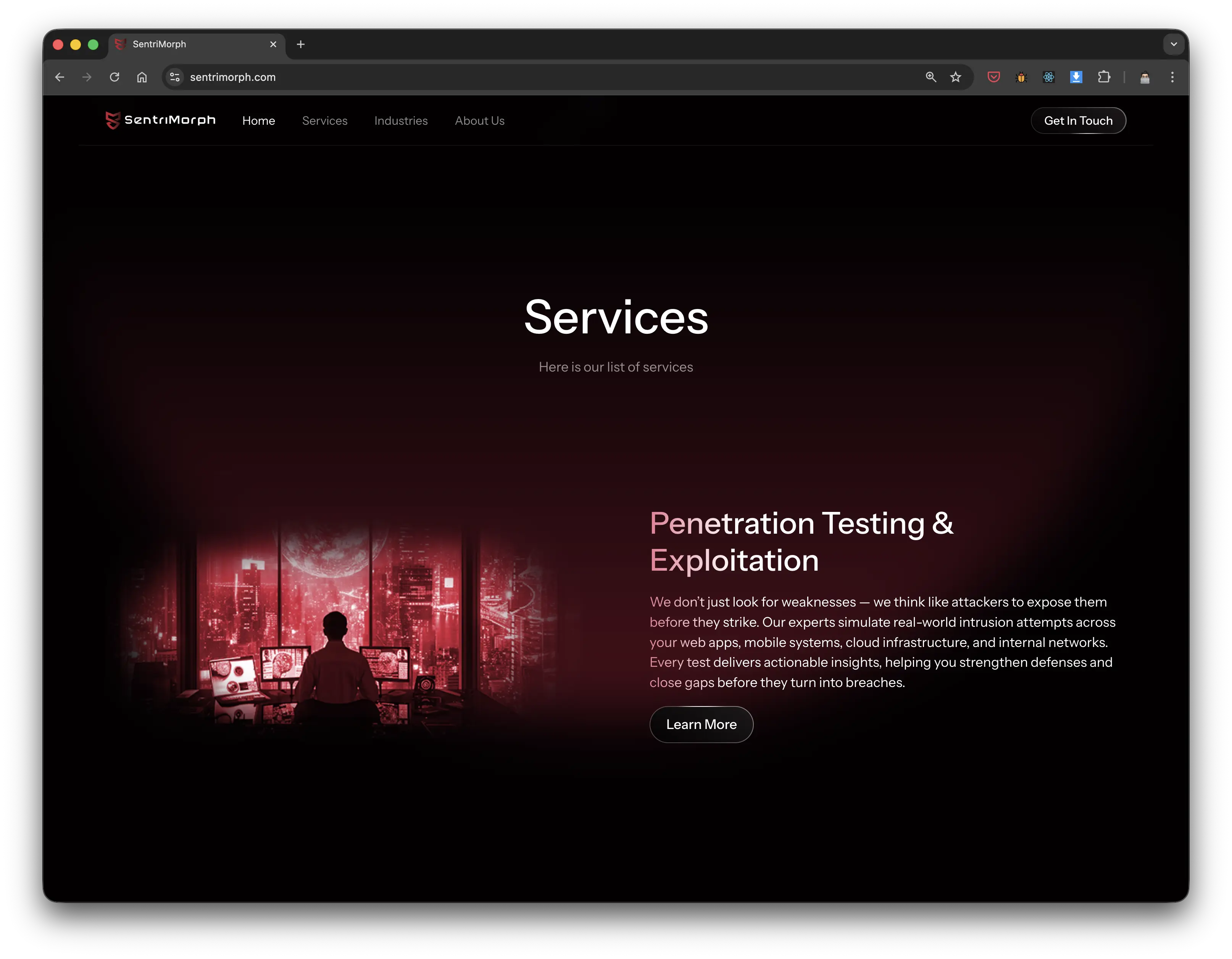
Three-pillar service structure — scannable, outcome-led, no jargon
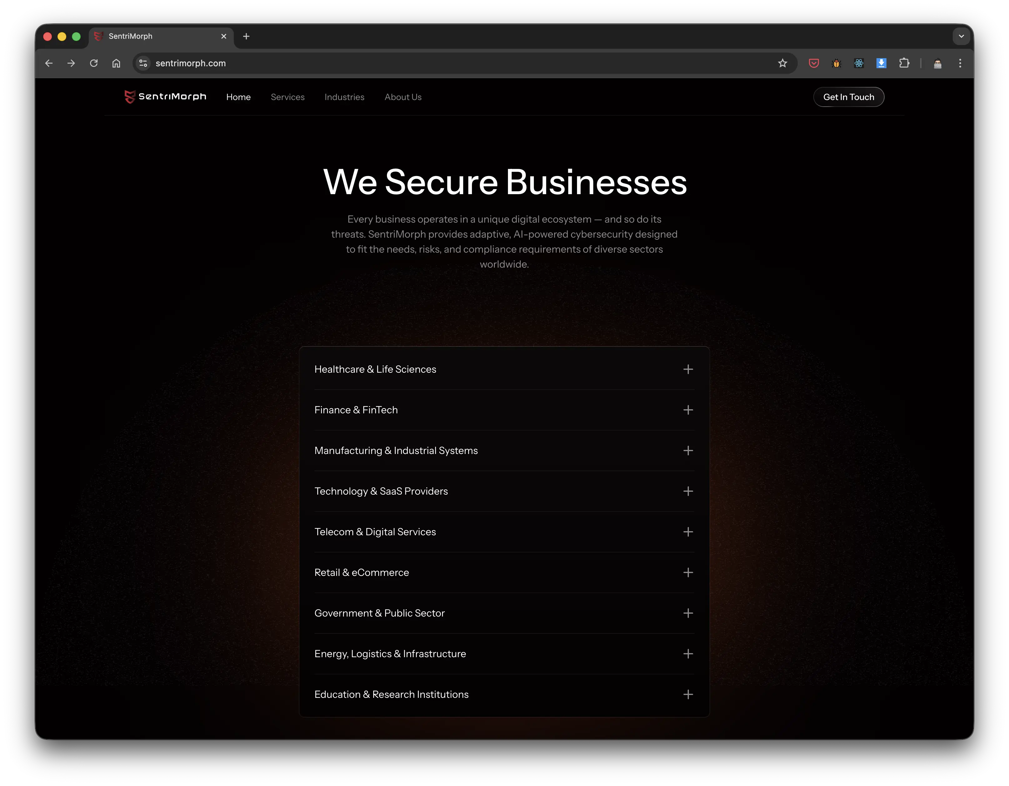
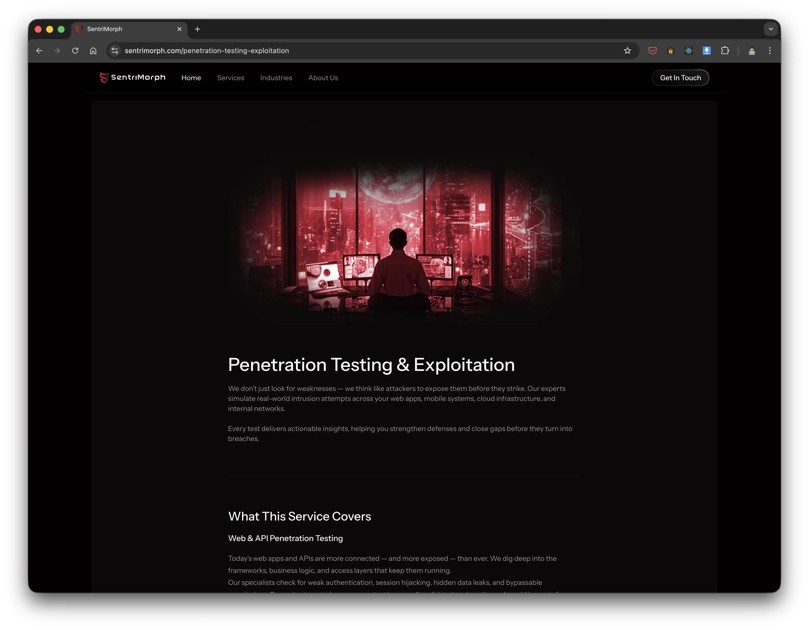
Progressive disclosure in action — industry accordion left, nested service depth right
How I Shipped in 22 Days
Two systems made this possible: a component-first design architecture in Figma, and an AI agent that translated it directly into production-ready Tailwind code — no redlines, no back-and-forth.
Strategic Move One
Build the System Before the Screens
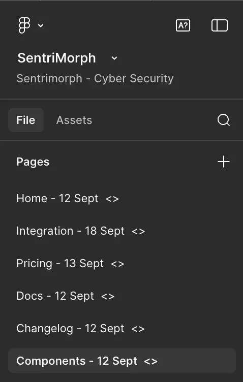
22 days isn't enough to design 5 pages from scratch and maintain consistency. So I didn't. I built the design system first — buttons with all variant states, navigation for desktop and mobile, accordion patterns, form components, pricing card layouts. Every atomic element defined before I touched a single screen.
I used strict Figma naming conventions with dev-status tags, advanced component properties, and a clean assets panel — so that every component could be used and updated without creating design debt. When the system changes, everything changes with it.
Building the system first meant that once I moved into screen design, each page was assembled — not drawn. That's where the 22-day timeline became possible.
.webp)

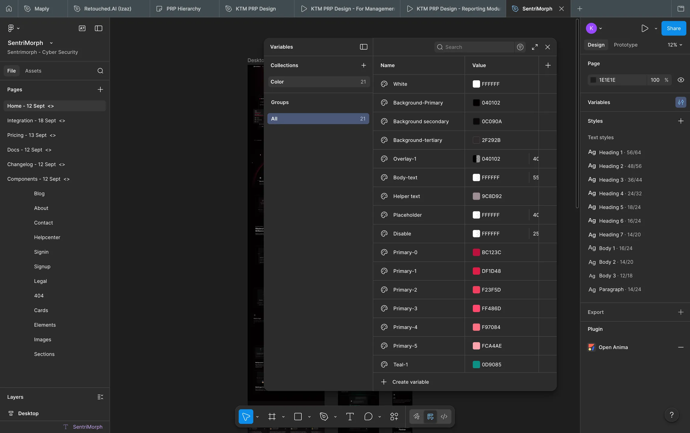
Naming conventions, component properties, assets panel — the full system architecture
Strategic Move Two
AI Agent for Design-to-Code Translation
Instead of traditional developer handoff — where design intent gets lost in spec docs and Slack threads — I used an AI agent to manage the entire translation process. The Figma design was the source of truth. The agent read it and generated the code.
AI agent live — Figma analysis, token extraction, component generation
Design to Tailwind — Figma tokens becoming real code in real time
Every Page. One Consistent Voice.
Five pages. One component system. One clear tone — intelligent, assertive, and human. Built in Framer on top of the Figma system, using the AI-generated Tailwind tokens as the production foundation.
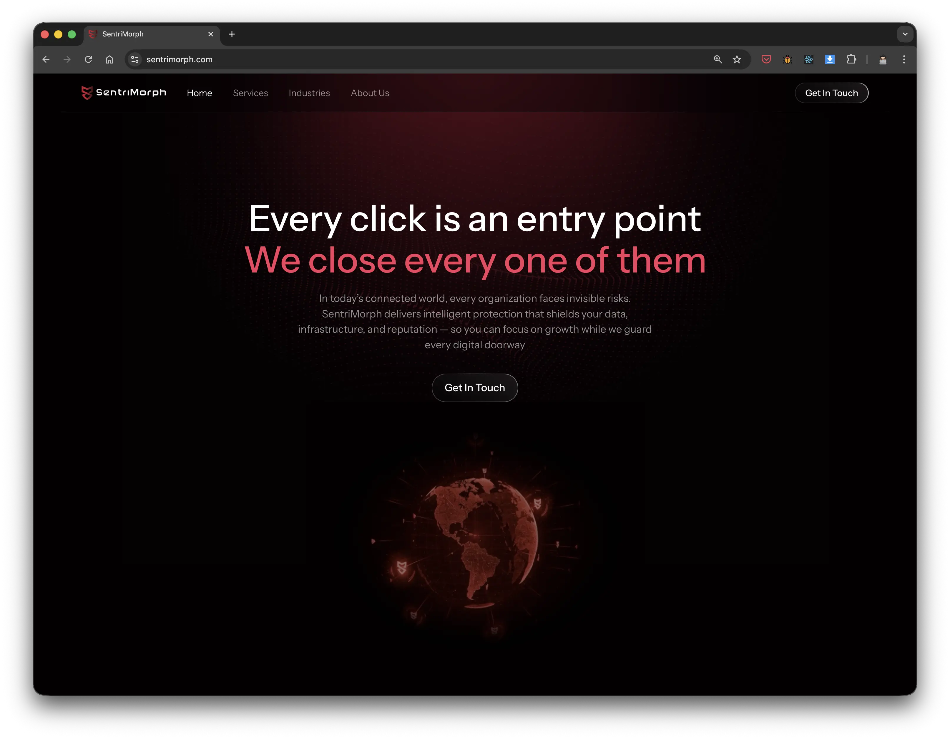
Homepage hero — "Every click is an entry point. We close every one of them."
Partner positioning — shifts from "vendor" to "ally"
Industry accordion — progressive disclosure for dense content
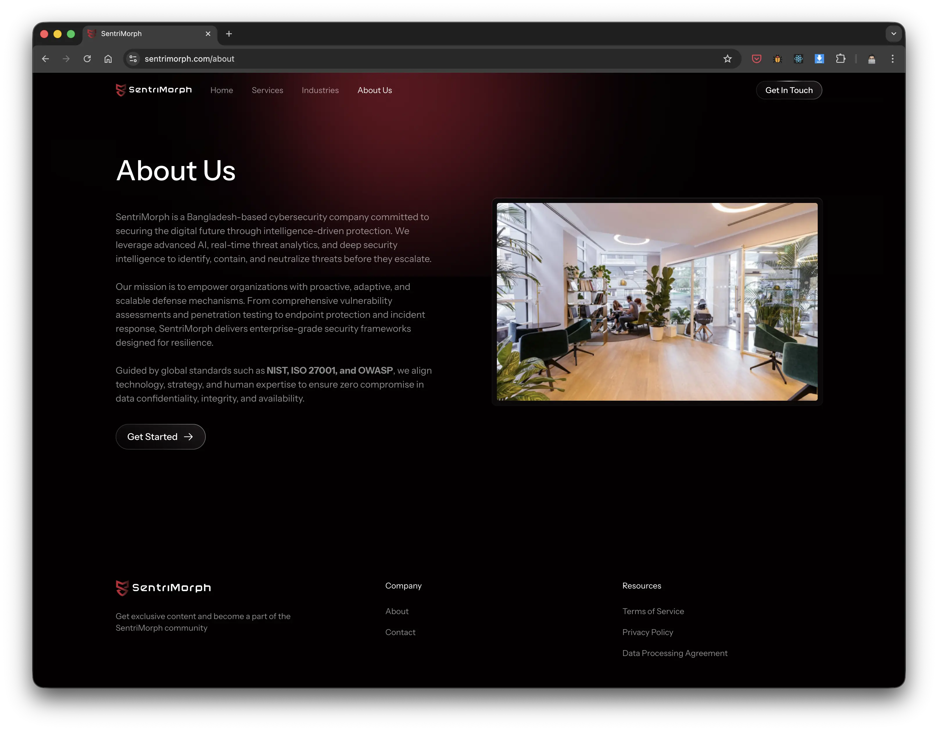
About — humanizes the brand, references NIST/ISO 27001 for credibility
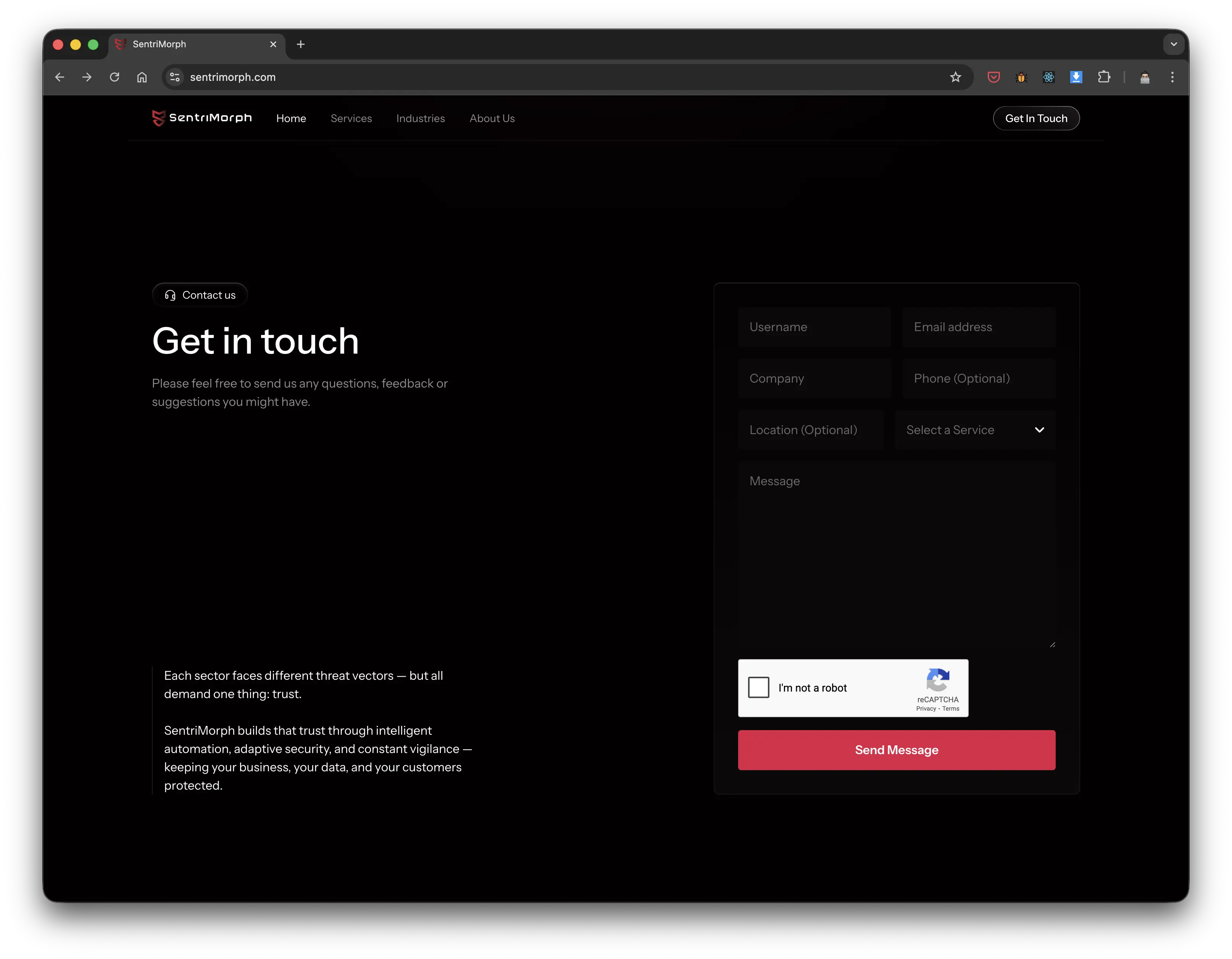
Contact — low friction, progressive form, conversational copy
Results & Impact
A research-driven strategy, a component-first design system, and an AI-powered build pipeline. The result was a full enterprise cybersecurity website — shipped in 22 days — that out-communicates vendors with 10x the budget.
Days to Ship
From brief to fully live website in 22 days — made possible by designing the system before designing the screens, and using an AI agent to eliminate the handoff gap between Figma and Tailwind.
Full Pages + Nested Service Depth
Home, Services (with nested sub-pages), Industry, About, and Contact — all consistent in tone, hierarchy, and component usage. One system, five experiences.
Decision-Makers Surveyed
Research across Norway and Bangladesh shaped every headline, information architecture decision, and CTA — making this one of the most grounded brand strategy exercises in the portfolio.
Redlines Written
The AI agent read the Figma file and generated the tokens. No spec doc. No redlines. The design was the source of truth — and it went straight to code.